9.11.2006

The geography of life expectancy


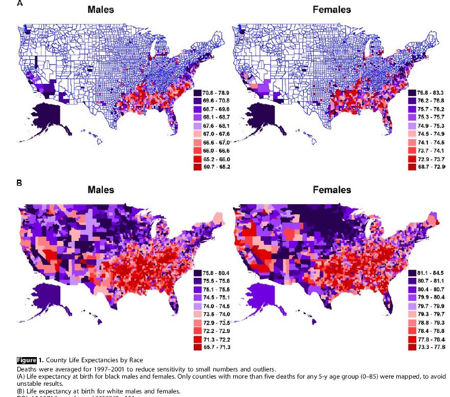
A new study (pdf) shows that there are marked geographical differences in your life expectancy. The differences are not solely attributable to race, income or health alone.

The map above shows differences in life expectancy according to the study. The upper two maps show life expectancies for blacks and the lower two for whites, by county.

This kind of study is interesting in that it shows that a health outcome is caused by multiple factors. Second, the authors concentrate on what they call the "eight Americas" (that is, where differences are most extreme. In this case, it is not surprising that there are differences when you look at the extremes (there usually are in any distribution), so I find that aspect less valuable/surprising.

What I think we can conclude is that health is not equally available to Americans, and that indeed it tends to be concentrated into the hands of a few. The majority of Americans outside this elite class are confined to shorter, less healthy lives.

The authors are admirably frank about discussing shortcomings in their data and methodology; shortcomings that are inherent in a large study such as this. They are realistic that for example, Asians may "return" to their country of origin if they are unhealthy and that this may lead to under-reporting of death rates in first generation Asian-Americans. A proportion of their data are therefore based on models and estimates.

9.10.2006

Ellen Churchill Semple


Semple in 1914

People of the Inquiry: Ellen Churchill Semple (1863 - 1932)

Ellen Churchill Semple was a well-known geographer who is often associated with the theory of environmental determinism, or the idea that human behavior was caused by the environment.

Semple's legacy continues to attract attention from geographers. This AAG session for example, takes issue with her characterization as (only) an environmental determinist, and suggests that she played a much richer role in geography (training many geographers, for example).

It's little known that Semple was one of the few women to play a role in the Inquiry, where she worked on the Austro-Italian border frontier, as well as Mesopotamia. She wrote a least four substantial reports for the Inquiry (#s 500-503):

#500 June 17, 1918: "An Abridgement of the Partition of Asiatic Turkey"
#501 June 3, 1918: "Report on the Partition of Asiatic Turkey"
#502 February 1, 1918: "Report on the Geography, Climate, Commerce, Transportation, Agriculture, Livestock, and etc., of Mesopotamia"
#503 March 13, 1918: "Report on the Strategic Character of the Austro-Italian Frontier"

(Inquiry reports are available from NARA.)

The Austro-Italian border was of course a major controversy at the Peace Conference, and Semple seems to have taken a largely pro-Italian position (that is, the one that eventually won out when Italy was awarded large tracts of territory at Austria's expense).

Semple was hired in late December 1917, when she was at the University of Chicago as an assistant to Douglas Johnson at a salary of $150 per month. She was 54 years old at the time.

One of her co-workers, for whom she had just completed Report #501 above penned this ps on a letter to Isaiah Bowman: "Dr Bowman, Miss Semple has done some remarkably good and quick work." Bowman wrote to her directly a few days later saying "may I add to his good words my own appreciation of your report [on Asiatic Turkey]...I read [it] through carefully and I think it is a splendid piece of work." Bowman followed up this personal letter with an internal one to the Inquiry Executive Committee (which he headed): "She is one of the most important members of the geographic team."

Semple did not work continuously for the Inquiry, but she was re-hired to work for Mark Jefferson in early September 1918, again at the salary of $150 a month. Jefferson was working on a population map of Europe (one of his interests; Jefferson was something of a pioneer of population mapping) and he set Semple to collecting data on city sizes--a somewhat lowly task.

In November, Bowman wrote a letter to Semple telling her rather obliquely that she had been cut from the Inquiry and would be traveling to Paris along with the rest of the team. In fact, the Paris contingent would consist entirely of men. Here are excerpts from this letter from which you may be able to judge Bowman's rather officious nature:

November 9, 1918
We have to begin immediately making our final arrangements. The staff of the organization must be cut down at once very considerably -- to at least a fourth or a fifth of the organization that we have maintained up to this time. So little time remains [the Inquiry would sail on December 4, 1918] that I have to act rather quickly, and I am therefore writing this letter at once so that you may make whatever adjustments are required under the circumstances.

It is not the thought of the Inquiry that its people should have their services discontinued immediately without making an adjustment in salary, and I am glad to state that the powers that be concur in this thought. Your salary will be continued until December 15th...your own part has been a large and important one, and for this I am authorized to express the thanks of the government authorities.

Believe me,
Sincerely yours
Isaiah Bowman
After the war, Semple was the first woman to become President of the AAG (in 1921). There is an annual Semple Day at the University of Kentucky which is now in its 34th year (Semple was from Kentucky).

In 1974 it was revealed that Semple had suffered from salary discrimination while at Clark University. In an article in the Professional Geographer, Mildred Berman printed an excerpt from Churchill's will, in which she revoked a clause promising a bequest to Clark on the grounds that her salary was deliberately reduced because she "was a woman without dependents." Semple estimated that by so reducing her salary compared to her less distinguished male colleagues, Clark saved $2,500 on her salary.

Innes Keighren, a Ph.D student at the University of Edinburgh, is currently do0ing a doctoral dissertation on Semple and her 1911 book, Influences of Geographic Environment.

When did abstract thinking begin?


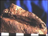
Ocher stone with coloring scraped out

Mapping involves abstract thinking of course; for example that one thing can represent another. A lot of scientists believe that in order to use things like color symbolism it must be attached to language.

Some recent work by Lawrence Barham of the University of Liverpool has pushed back the date at which humans might have started thinking abstractly to 200,000 years ago, double the previously accepted date. The exciting implication of this work is that perhaps this means language is equally as old.

You sometimes hear it said that mapping as an activity is almost a human universal, and some (eg., Brian Harley) have even said that it predates (written) language. While for many scholars the earliest known map is only 5000 years old (a clay tablet) or perhaps a wall painting from Turkey, this is obviously far short of 200,000 or even 100,000 BCE.

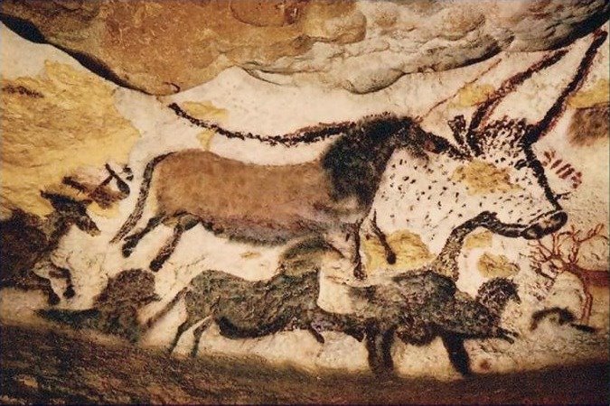
If you include paleolithic art such as the famous Lascaux caves that takes you back to around 15,000 BCE even if this could be considered a "map."

.
Lascaux cave paintings

Barham's work--if accepted--would force a reinterpretation of the earliest use of symbolic and abstract thought by humans. Perhaps it would also lead to a much older origin of mapping as well?

Edney's huge annotated bibliography of the history of cartography

I'm finding this a little late, but it's well worth a notice. Matthew Edney (Director of the History of Cartography project) has published a massive annotated bibliography of the history of cartography (also available as a pdf).

The fun part of this is Edney's acerbic comments and opinions. For example:

With the failure of the models of cartographic communication, of the parallel to spoken language, and of the psychophysical approach to map design (effectively moribund by 1983), academic cartographers who were not hypnotized by digital technologies increasingly turned to semiology/semiotics (the study of sign systems) as a means to conceptualize maps.
In fact, a (small?) number of people would not quite accept that cognitive experiments with maps has become moribund, although with the retirement this year of two of its leading practitioners (Bob Lloyd and Ted Steinke) it is easier to make the case (though why 1983?).

Bad-boy Denis Wood gets his own section which produces the following observation from Edney:
In these three studies, Wood set out to puncture what he understands to be academic cartography’s fatuousness. With his consciously un-academic (even anti-academic) prose style, he skewered the academic field’s self-imposed restrictions concerning, respectively, map design and map design research (too dry, too stultifying), the relation of the map to the world (too dry, too pseudo-scientific), and map reading (too dry, too factual). In its place, Wood advocated a discipline that is truly engaged with its subject matter and not intent on defending some parody wrung dry of all color and poetry.
An excellent summary!

This is an updated bib. from his earlier hard to find 1998 version.

9.06.2006

The present culture of fear

Update: Arianna blogs her experiences that night, particularly citing Max Cleland as a hero.


When you sow the seeds of fear, then the result is likely to be a country made supine and weak. We should count up the number of stories such as this one in which we have now sunk so far to our knees that we react irrationally to a bottle of water:

Air passengers from Charlotte to Little Rock, Arkansas, had to hurry off their plane Friday after someone found a suspicious liquid on board.

The flight landed at Little Rock as scheduled Friday afternoon. But about seven miles before it landed, a crew member reported two passengers with two bottles of liquid. Police, firefighters and the bomb squad were called in, but the liquid turned out to be water.

On Friday I was feeling well enough to walk up to our local highly regarded women's college, where Arianna Huffington was giving a talk about her new book On Becoming Fearless. It was very nice to be able to walk to such a cultural event and made me feel quite proud of my neighborhood. I don't live in a big city such as New York, Chicago or LA. Huffington is a good speaker, she had a positive message, and she spoke without pretensions. Her message was not that we can get rid of fear, but rather that fearlessness is the mastery of fear. At the start of her talk she cited the example of senator Max Cleland, and then surprise! Out he came and gave a short extemporare introduction for her.

When you live by fear, everything is a risk, and you feel the need to eliminate the risk. The alternative is to accept that life is indeed risky and not to let it run your life. Being fearless is an acquired skill (she cited the fact that she was at dinner last week and her daughter was at the beach with a friend and was supposed to call her. When she didn't she called her daughter's cell phone, her daughter's friend's cellphone and her daughter's friend's mother's cellphone--all without result--before realising that she was being driven by fear. Of course, her daughter soon called her).

Just as fear can be reduced, so it can be increased (she didn't say this, in fact her talk was explicitly non-political, but I think it follows both from what she was saying and from common sense). One powerful way to increase fear is to characterise certain things as dangerous. If those things are common (types of humans, say Muslims, or types of objects, say liquids) then it is likely that not only will fear be increased when those types or categories are encountered, but we will also tend to see and notice those categories of things more frequently, again, increasing fear.

These specific fears can be supplemented by authorities by non-specific and just general background fears, the causes of which we are not informed about, but asked to take on faith. the color-coding system is a good example of this, as is the output of local and national news programs purporting to examine fear, but in fact just providing more reminders of it.

What are some of the tricks for reducing your feelings of fear? One surprise: Huffington says she always makes sure she gets enough sleep. Huffington also said that you can gain strength from past denials of fear, once you do it (for example, in her case leaving her lover of seven years, the prominant British critic Bernard Levin) and coming to the USA. She also gave tghe example of writing, where you are your own worst critic and reconsider each and every sentence that you write. She finally adopted a technique where she would write a sentence, and if her internal fear-critic judged it badly, simply wrote a red question mark next to it and continued writing, coming back to the sentence if necessary later. In this way she acknowledged the fear, but was not incapacitated by it, and reassessed it later when the emotiuon wasn't quite as hot.

I'm sure there are other common sense techniques like this you can imagine (her talk was not really about these techniques but about examples of mastering fear, nor was it one of those useless self-help guides you see in the stores). The point is that the country right now is mastered by fear. Our leaders share the blame for this due to the way thay have deliberately produced and generated fear in this country. But they will only be successful if we allow them to continue to instil fear in us.

9.05.2006

How we have fallen


Most people may be aware that productivity has steadily increased over the last half century or so. In 1960 for example, the productivity index was just half what it is now.

But did you know that wages have steadily fallen since the early 1970s? In 1973 for example, real wages were $15.73 and in 2000 they were just $14.15 (per hour, in 2001 dollars).

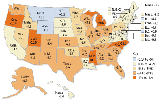
The map above shows how incomes have dropped over the last six years, state by state. Only four states saw an increase, and some states saw drops as large as 12% in just six years.

In David Harvey's new book (A Brief History of Neoliberalism) he accounts for this with the so-called "Volcker shock." Paul Volcker was Chairman of the Federal Reserve Bank under President Carter and Reagan, and it was during the 1970s that the neoliberal policies of Margaret Thatcher and Ronald Reagan began to assume prominance. Volcker radically raised interest rates. New Deal policies of full employment were dropped in favor of anti-inflationary policies, paid for with high interest rates.

Couple this with the deregulation that Reagan pursued (breaking the unions who had previously protected workers' income) and you've got the explanation. For example, the minimum wage was on a par with the poverty level in 1980 but was 30% below it in 1990 (it was last raised in 1996).

Those are some of Harvey's arguments. It's a very good (and brief) introduction to the shift to neoliberalism we have experienced in the US and UK, not to mention neoliberal trends in China and South America. It does leave one wondering how neoliberalism might be combatted or countered, though.

9.04.2006

Men of the Inquiry: Armin Lobeck


(This is one of an occasional series on the men and maps of the American Inquiry.)

Background.
Lobeck was one of the first men specially targeted to join the Inquiry in the early days (November 1917), the same year he got his PhD at Columbia (where Douglas Johnson was). His salary was to be a reasonably competitive $183 a month (Ellen Churchill Semple by contrast received $150 a month). Lobeck became professor of geology at Columbia in 1919 and stayed there the rest of his career.

Papers.
Lobeck's papers are held in at least three archives. Columbia University holds papers relating to his journey to Paris with the Inquiry, the National Archives contain his correspondence, maps, and papers relating to the inquiry and the American Commission to Negotiate Peace (the official name of the Inquiry in Paris), while the American Geographical Library in Milwaukee contains papers about his career more generally, including some correspondence while at sea on the way to Paris.

Joining the Inquiry.
After graduating with this PhD Lobeck was ordered through the Selective Service law to perform military service at Camp Dix, which caused some problems for the Inquiry. Bowman wanted him, and Walter Lippmann (the famous journalist) and Inquiry member was tasked with extracting Lobeck as quickly as possible. Copying Bowman's words, Lippmann telegrammed Ralph Hays at the War Department:

[Lobeck] can make a kind of map which we absolutely need to have made and there are only four men in the whole country who can make these maps. We shall need all of them. Try to arrange [his release] immediately as these maps are basic to all our work (Lippmann - Hays, 16 Nov. 1917).
Hays was reluctant to let Lobeck go by "imperial edict" as he put it, but was willing to have Lobeck detailed or furloughed to New York for the duration. This would allow the army to gain Lobeck's service after his return from the Inquiry. The War Department further queried Lippmann's request by stating that they "supposed map-making was a rather easy job for topographical engineers, and that there were welters of competent people in the country doing it" (Newton D. Baker-Lippmann, Nov. 17, 1917).

Here Lippmann was drawing on his extensive network of colleagues in high places, as he would throughout his career (Lippmann was an assistant to Baker when he was appointed to the Inquiry himself and addressed him familiarly as "NDB").

Lippmann and Bowman sat down and drafted a response that would explain their need for Lobeck's skill in drafting block diagrams. It was, they said "a highly specialized and accurate form of drawing and is not ordinary map construction which can be done by almost any trained engineer or draftsman. It is display in perspective of the relief and hydrography of a region with all the geometrical accuracy of a map." Bowman signed it as Director of the AGS.

Lippmann added that the Inquiry planned to use Lobeck for about six months, although this would in fact turn out to be woefully wrong; the number seems to have been chosen merely as something the War Department would accept. Lippmann and Bowman wanted these maps for the “Western Front from the Alps to the sea, carefully arranged to show mineral deposits, water ways, etc. We shall make similar maps for the belt of territory from the Baltic through Mesopotamia, so that the wholeBaghdadd corridor as well as the end of the Adriatic will be displayed” (Lippmann-Baker, Nov. 21 1917, Lobeck files). Although the Adriatic and Italy were mapped in this way, there’s no evidence that the Mesopotamia region was ever mapped like this, but I must admit I have not explicitly yet checked if there are any files on this region.

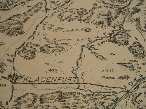
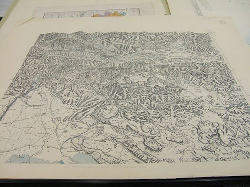
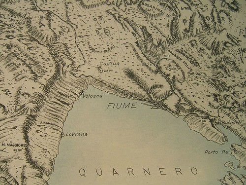
If we look at LobeckÂ’s Istria map we can see the level of detail involved.


Meanwhile, Lobeck was whiling his way at Camp Dix, where the order to extract him was taking a little while to be processed. The plan was to have him enlist in a kind of reserve enlisted reserve (the Engineers Reserve Corps.) which would take him off active duty status. Lobeck kept a positive spirit about it all, despite a few complaints about the amount of paperwork needed to get him away.

In a letter to Bowman he wrote that “the barracks are cheerful and comfortable and I sleep wonderfully…This week in spite of the very bad weather we have been on the big rifle range learning how to use the new Enfield pieces with high power ammunition…you know we have to march 51/2 miles to the range. Many of the men had frozen ears and it was necessary to bring them back to camp by ambulance.” (Lobeck to Bowman, Dec. 13, 1917).

Lobeck also commented on his fellow reservists and their lack of training. “An infinitely small percent of the men are technically trained. Most of them are of the laboring type and many of them are of foreign origin and can hardly speak, let alone write English.” (Lobeck to Bowman, Dec. 13, 1917). Lobeck finally made it to New York City on Boxing Day, 1917.

Work for the Inquiry.

In the summer of 1918, after working on the Italian area all spring, Bowman, who was spending Independence Day in New Hampshire, directed that Lobeck should begin work on a block diagram of the Guatemala-Honduras border region. It was an urgent job; Lobeck would have just two weeks to complete it, but he could have the help of Dominion.

Leon Dominian was originally from Turkey, although he had lived in the USA since 1912. As a member of the AGS staff, he was an obvious candidate to become a member of the Inquiry, where he worked for Clive Day on the Balkans. In 1913, shortly after Dominian arrived in America, he was involved in a strange controversy concerning a theory put forward by a Marshall B. Gardner that the earth was hollow. This was around the time that the earth’s poles were first being explored, and leaving all sorts of strange phenomena unexplained (frozen mammoths etc.). After Gardner had published his book, the Pittsburgh Leader decided to take him seriously enough to contact the AGS for a rebuttal. Dominian was deputized to refute this theory, which he did, at least to the satisfaction of the newspaper (Gardner believed he in turn counter-refuted Dominian). Probably every academic gets these requests—I remember when I was grad school I was contacted about whether an egg can stand up on the equinox (I’m not sure how they got my name).

Dominian had written a survey book on Europe’s languages in 1917, which demonstrated its susceptibility to racist arguments by the fact that it carried a foreword by Madison Grant. Grant’s own book, The Passing of the Great Race, lamented the falling from rightful power of white people. Nevertheless, despite these racist tones and the fact that Grant helped agitate for racist quota-based immigration laws in the 1920s, he remained a Councilor of the American Geographical Society for many years, including while Bowman was Director. In another footnote to history, the well-known Berkeley anthropologist, Alfred Kroeber, gave an immensely positive review to Dominian’s book: “an introduction by Madison Grant emphasizes the prevailing lack of race consciousness in Europe and the circumstance that language is the essential factor in the creation of national unity and nationality” (Am. Anth. 20(3).

Lobeck’s maps were not puny affairs, but rather large scale sheets, often five feet by five and done at tthe regional scale (eg., 1:300,000) with a vertical exaggeration of four times. In this way he could show in detail the area of interest—the border between Guatemala and Honduras is no less than two feet long for example.

While LobecksÂ’ block diagrams were certainly attractive and easy to use, one problem with them was that it was hard to get a sense of absolute height. They dealt more with the relative relief, what one ridge looked like compared to another. An ordinary map however such as a topographic map in common use in the military, had the advantage that absolute heights could be determined, so that for example it could be seen whether one ridge was visible from another one, or if one portion of the map was higher than another portion.

Lobeck wrote excitedly to Bowman on July 7, 1918 with a proposal for an “entirely new way” of showing relief that would solve this problem. His suggestion was to combine his block diagrams with contour lines shown in perspective. The result “is simply a bold rounded outline of the mountain ranges” with the contour heights labeled.
9.03.2006

History of Cartography exhibition at Field Museum, Chicago

An exhibition called "Maps! The History of Cartography" will be mounted at Chicago's Field Museum in conjunction with the Newberry Library later this year:

The Field Museum, in partnership with the Newberry Library, will offer an unprecedented exhibition of some of the most rare and historically valuable maps ever created. Visitors will see, assembled for the first time, maps and artifacts drawn from collections around the world. This collection of maps will challenge our views of the world by emphasizing that maps tell us not just where we are, but who we are. Any map, no matter what else it shows, also conununicates how the people, nation, government, or organization that made it viewed their worlds. Each section will feature a wide variety of map types, formats, and functions. The exhibition will also utilize a variety of media to explain to visitors how maps were made in the past and are being made today. Curators. Dr. James R. Akerman, Dr. Robert W. Karrow, Jr., The Newberry Library. For more information, please contact: Todd J. Tubutis, Senior Project Manager, Exhibitions, The Field Museum, 1400 S. Lake Shore Drive Chicago, IL 60605-2496. Many of the maps will go to an exhibition at the Walters Art Museum in Baltimore when the exhibit closes.
I found out about this because of a piece in the Chicago Tribune on Milwaukee, which apparently has a large J.R.R. Tolkien collection, and which is contributing some Tolkien maps.

9.01.2006

Sick

Interesting to see that loyal ubikcans are still visiting the site even when there are no posts!

Sorry, but I've been laid out with bronchitis this week. I feel like the old man at the end of 2001: A Space Odyssey when he's lying in bed, breath rasping, and the monolith appears at the foot of his bed. About all he can do is weakly raise his hand (yearning? expectation? greeting? warding off?) before he's transformed into the Star Child.

(Yes, there's a fever that goes with B. which helps explain such lurid dreams...)

Anyway, according to the figures, there were over a 1,000 visitors last month. Thanks for your interest and I hope to be back again in a few days!

8.27.2006

OH-Gov: Strickland (D) 57, Blackwell (R) 32%

Rasmussen poll.

I'm going to Ohio in October and I'll be glad to see it gain a Dem. governor for the first time in 16 years, what with it being a swing state in the presidential elections and all. NYT has this one firmly in the "leaning Dem" column.

Hurricane maps from Weather Underground


One of the other comments to the piece on science mentioned in the previous entry was on the maps produced by Weather Underground.

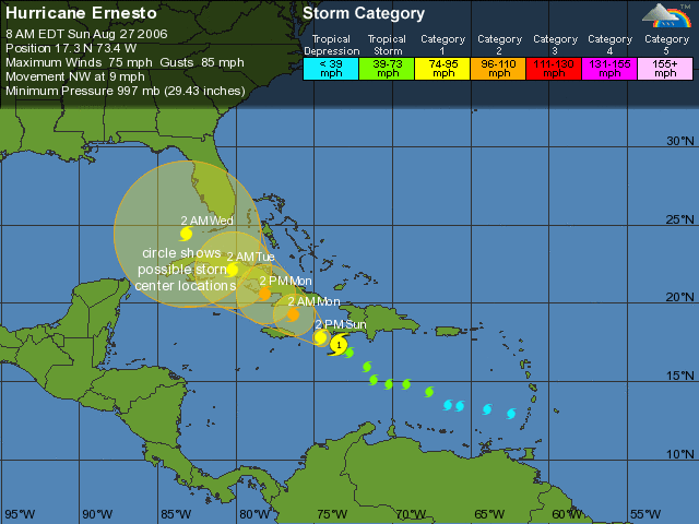
The map shows the current location and strength of tropical storms and hurricanes, as well as the predicted location over the next few days. A circle of increasing diameter shows where the storm might go.

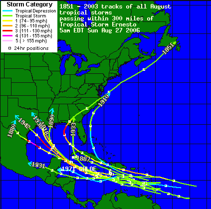
Strength is shown using different colors. Other features include a map showing all the storms since 1851 that passed within 300 miles of the current storm (Ernesto, this season's first hurricane) and where they went:


As everyone probably knows by now, this is the one-year anniversary of hurricane Katrina. We had a significant number of refugees from New Orleans come to Georgia and the Atlanta metro area last year. I wonder how they are doing.

Science and politics

Interesting post at Daily Kos from their science correspondent, attacking the notion put about by some that science is dead. Apparently some dude on a right-wing blog made the claim that science has been dead since say 1850. DK responds:

I recommend you do not read the actual post on the Blogs for Bush site (That Jon is referring to), unless you're a masochist. The rant goes downhill from there, some of the comments are worse. The dingbat author's thesis is that science is 'dead,' that in fact science has been 'dead' since roughly 1850. Nothing to see here folks, ignore relativity and the atomic bomb, refuse that useless antibiotic and don't look at that flat-screen ...

Witty snarkisms aside, for rational conservative and centrist readers: I understand we may have profoundly fundamental differences in some matters of ideology, but I hope we can agree that this kind of shit is dangerous when and if it infects the powers that be. If the Blogs for Bush guy was just a lone wolf hysterically barking at the moon, it might be funny, it might be sad. Problem is, Bush and Rumsfeld and James Dobson and a third of the nation are out there with their eyes fully dilated yelping at the night sky with him.

The thing is, flat screen TVs, the atomic bomb etc. are technologies, not science.

And technology affects people in complex, multifaceted ways, not all of them desirable, even if we all could agree that science is desirable. As one of the comments to this post even points out:

In the forties, fifties and sixties there was excitement about things like space travel, men on the moon, James Bond high tech gadgetry, computers, and especially automobiles and other things that went really, really fast.

I can remember when people believed in science with a religious zeal. Guys read popular mechanics and tinkered with things in their basements, and in general we trusted our academic institutions to be like some sort of flawless priesthood, above the coruption of government and corporate funding and able to resist the corruption of the military industrial complex turning everything science came up with into some sort of weapon.

Then came "The Silent Spring", Earth day and concerns about overpopulation, polution, and war. Three Mile Island, Chernobyl and the Challenger disaster began to give people second thoughts about where science was taking us.

Those things cost us our faith in science in the same way pedophilia in the priesthood makes some people a little more cynical about the advoce of their religious leaders.

An awareness of Global Warming and Nuclear Winters begain to turn perceptions of bright shiny science into something that always corroded its pipes and blew up its lab.

Most people have become dissillusioned with science. They think of it as something only a few really smart people understand and thus nothing to do with them.

Finally we got the corporate ludites who didn't want science messing up the bottom line. Industrial design has become all about the packaging and whats on the inside has become more or less irrelevant as long as somebody can sell it.

So no wonder people are skeptical of "science." Scientists have not only delivered a rather mixed bag of results (3 Mile Island, global warming). Add to that the claims that scientists have made that turn out to be misleading (such as on race-based drugs for example) and dispiriting ("evolution shows we live in a world without meaning or necessity for religion"--Richard Dawkins) and its likely that people will turn away from science, or at best learn the bare minimum they need to get through college.

A student said to me just last week "science is based on faith" (a mantra the creationists have used for years). There's nothing I would say that would persuade her of the truth of natural selection and descent with modification, mutation, genetic drift etc. But I know brow-beating her with the claim that science is the only way to know the world, and that it progressed from myth-religion-science surely won't do it. (Anybody feel we have left all myths and superstitions behind?)

We need a more realistic assessment of science as a human exercise of the creation of knowledge.

8.25.2006

Geography teacher reprimanded for... teaching

A geography teacher was reprimanded and put on paid leave after hanging up foreign flags:

Eric Hamlin said the flags were part of a world geography lesson plan at Carmody Middle School and refused to take them down. The school's principal escorted Hamlin out of class Wednesday morning after he refused to remove the flags of China and Mexico.The school district placed him on administrative leave for insubordination, citing a Colorado law that makes it illegal to display foreign flags permanently in schools.
He has now decided to leave the school, saying the issue has divided the community. Apparently Colorado has a law:
District officials feared Hamlin's display violated a state law prohibiting the display of any flag but the American, Colorado or local flags on public buildings, including schools. Temporary displays for instructional or historical purposes are exempt, but the school principal did not consider Hamlin's display temporary enough.
Hamlin however has stated that he was just doing his job:

"It's much along the lines of a science teacher who puts up a map of the solar system. They may not spend every day and every lesson talking about Mars, but they want the students to see that and to see the patterns of the planets and the order, and the students will observe that and absorb that learning visually," Hamlin said.Hamlin said that the school district is not only depriving him of a teaching tool but also taking away from his students' education."The major problem I see here is with the law that limits educators," Hamlin said.
Some commentators tried to make this out to be part of a leftist plot. Meanwhile comments on the local TV news station bulletin were largely in favor of Hamlin:
"Our daughter was in Mr. Hamlin's 7th grade class last year. Mr. Hamlin is one of the best teachers our family has ever encountered. He does not have a right or left wing agenda, but a desire to educate 7th graders. He is very knowledgable in the subject matter that he teaches and highly skilled and effective as a teacher. The fact that there is a law like this is wrong. The school is wrong for standing by this "letter of the law" type argument. Let him teach, the kids will be better for it."


Thin House districts

A thin House district is one where the current incumbent had a thin margin of victory in the last election and thus is a prime candidate to be knocked off. Here's a map of all the districts that went GOP last time and which voted for Bush, but the margin was less than 5%:


This is really useful if you're targeting certain races, such as these "top" 30 House races. The danger of incumbency: only 4 of the most likely seats to be overturned are Dem.

In order to change hands this November, the Dems need pick up only 15 seats.

Election maps: messing and assessing


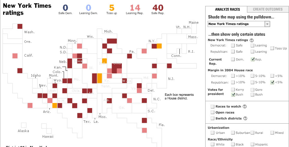
Here's the NYT election map I showed in an earlier post. This time I've set it to display the close races in Governor's races, and the one in Ohio in particular. The current governor, Bob Taft (R) is term-limited, but even if he could run again it's not likely he'd win due to his ethical transgressions. The WaPo's "The Fix" designates this race the second-most likely to switch parties in the midterms (from R to D; NY is the most likely, also R to D).

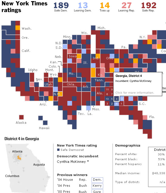
The NYT has the easiest and best map to use to get an overall handle on the races. Here's their map of House races, which they show as districts of equal size:


GA-04 is my district, previously held by Cynthia McKinney (D). However, the state Republicans heavily redistricted this district and McKinney lost badly in the primaries, and will not be returning to the House.* It's not likely to switch parties though as GA-04 is a strong (D).

The Washington Post also has an interactive election map:


Very similar in some ways to the NYT, but it takes a different approach in that less information is delivered on the map, but there's more linked textual information. If you click on a race it takes you away from the map to a text page which discusses the race and provides socio-economic data. But unlike the NYT map, you can't configure it to show those races where say the district voted for Bush but went with the Dem House candidate in urban areas... The NYT map is much more flexible and allows you cut the data in many ways. OTOH, the WaPo analysis is more up to date. NYT still hasn't got the August 8 primary winners up.

The winner here: The New York Times. Cartographers at the Post need to get back in the game.

*As of this writing, four incumbents are out (lost in primaries); 1 governor (AK), 1 Senator (CT), and 2 Reps (GA-04, MI-07).

8.24.2006

Do these guys look like terrorists?


Or Bollywood film stars?

These are the two lads who were flying from Malaga to Manchester (they're actually students) and were thrown off because the other passengers thought they looked like terrorists (see earlier story).

How easy is it to tell who they are just by looking at them? Well we can use stereotypes, or as they say themselves:

"We might be Asian, but we're two ordinary lads who wanted a bit of fun," Mr Ashraf told the Daily Mirror.

"Just because we're Muslim does not mean we are suicide bombers."

The pair were marched off the jet at gunpoint after fellow passengers alerted officials on the flight back from Malaga, Spain.

Or maybe they're just litigants in a wrongful detention case.

8.22.2006

Finding out where a blog is based through its visitors


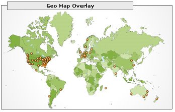
If cyberspace has no geography how can you explain this map? (Sorry about the obvious Mercator projection.) Map produced in Google Analytics.

This blog gets several dozen visitors on a good day and the map above shows where they come from. The most striking thing to me is that they center on SE United States, even though my blog is not about the SE, nor have I discussed where I am located, apart from in the blog description.

Is it because I've blogged about Atlanta in the past? But the above map only shows visitors in the last few days and other data I have shows that visitors have not been reading older blog entries.

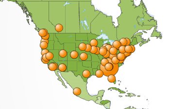
So what explains this pattern? Here it in more detail:


Yes I am in the SE but why are visitors coming mostly from the SE but not reading any SE related articles? How is there, in effect, a big target over my location from the pattern of visitors?

Update: The commentator below asks how many are from myself. Bingo. That must be it. I've excluded my own visits from the sitemeter counts, but didn't do that for the Google analytics. I've tried to do that now and we'll see if it makes a difference (the two places do it in very different ways. Basically with Google you have to exclude a specific IP address. I think sitemeter uses cookies).
But still, it's a good surrogate measure of where a blog is located in real space.

Do polls matter?

Perhaps I should say, how do polls matter? Polls are a form of data collection and have interesting geographical patterns.

Exit polls in an election are generally accepted to be very accurate because they record how people actually voted.

Other polls are more variable. If you ask people over 18 how they would vote "if the election were held today" you may or may not get a good prediction. First, longer time periods before the elction are less accurate than taking polls nearer the election, not just in the samer sense that it's harder to predict the weather in 3 weeks, but also because people exercise free will and the right to change their mind. Though interestingly, taken as a whole, these polls are better than you might think at making accurate predictions (though they might not predict particular winners and losers in tight races). A rolling average of say the last 3 months is quite good at recording overall conditions.

Second, pollsters use various "models" and don't actually just ask people of voting age. It's more accurate if you can get either registered voters or likely voters or at least a good proportion of these in your sample.

All this being said, a widely reported poll by CNN now shows that 61% of Americans--a new high--are opposed to the war in Iraq. It would be interesting to see how this breaks down at a more local level, and to see, for example, how it plays in places that are likely going to be important in November. The trouble is we don't know for sure ahead of time which places that will be (apart from generalities like "Ohio").

General polls however are only useful as far as they go, similarly general geostatistics characterize the population as a whole. Moran's I for example, is a general statistic and does not speak to local variation. Most of the interesting stuff however are the local differences--we live in that sense "locally."

This does not invalidate "global" polls, particularly when the President tries to characterize those against the war as Democrats (unless he accepts that 61% of the country is a member of the Democratic Party). But it does show we need to know the local situation on the ground before we make inferences about any given place.

8.20.2006

The politics of fear

This has implications for those geospatial approaches that rely on profiling and serves as a warning about the consequences of stereotyping:

British holidaymakers staged an unprecedented mutiny - refusing to allow their flight to take off until two men they feared were terrorists were forcibly removed. The extraordinary scenes happened after some of the 150 passengers on a Malaga-Manchester flight overheard two men of Asian appearance apparently talking Arabic...
It also raised fears that more travellers will take the law into their own hands - effectively conducting their own 'passenger profiles'.
We saw this already after 9/11 when many Americans expressed a fear of "Muslims" and the FBI started compiling a database of mosques. The current political climate in the US and the UK produces a politics of fear based on the construction of a group of people. Thus guilt is assigned not based on actual actions but deemed membership of this group. This is exactly the same logic as racism and the hysteria about immigration (see previous post).

Apparently this story has been applauded by some commentators. Glenn Greenwald puts it forcefully when he says:
But it is the irrational fear here that is so striking, and really quite pitiful. They have whipped people into a state of such intense paranoia that they quiver at the sight of two Arab males on their plane. There is roughly one billion Muslims in the world, including some countries which have more than 100 million. The U.S. alone has 10 million. Enormous numbers of Muslims are not Arab and do not reside in Arab countries. There are 320 million people living in Arab states, and it should go without saying that only a tiny handful of them are "terrorists" (and that many terrorists reside elsewhere). To start refusing to fly or take buses or trains or be in the same room with the males in that population -- which is clearly the path we are on -- is just stupid, hysterical, and counter-productive from every perspective.
The fear is not actually irrational, imho, but a product of the deliberately instilled politics of fear in which we now live. The task is to defy that politics by a refusal in the geospatial community to use geoprofiling in the same way that the New Jersey police no longer perform racial profiling.

Innumeracy and immigration

How many illegal immigrants are there in this country? This question has relevance not only for those of us who use population data but it is also a warning against uncritically accepting numbers just because they are frequently repeated.

During the immigration debate over the summer leading to the mass protests on May 1, the number "3 million" was constantly repeated: there are 3 million illegal immigrants coming into this country every year. A moment's thought should reveal why this number is problematic.

First, the total number of illegal immigrants is also often cited as being around 11 million. Both numbers can't be right.

Second, the figure has its origins with the border agents who say they apprehend about 1 million people annually, and estimate that three times as many actually make it across. As the mathematician John Allen Paulos (author of Innumeracy) this number is based on the number of apprehensions they make, and this includes many people who try repeatedly to cross the border. Additionally, their estimate that 3 times as many go unapprehended is of course just that--an estimate.

Numeracy in GIS is as important as graphicacy, and like maps numbers are political. It's advisable to always ask "in whose interest is this number produced? Under what circumstances was the number produced?"