Election maps: messing and assessing

Here's the NYT election map I showed in an earlier post. This time I've set it to display the close races in Governor's races, and the one in Ohio in particular. The current governor, Bob Taft (R) is term-limited, but even if he could run again it's not likely he'd win due to his ethical transgressions. The WaPo's "The Fix" designates this race the second-most likely to switch parties in the midterms (from R to D; NY is the most likely, also R to D).
The NYT has the easiest and best map to use to get an overall handle on the races. Here's their map of House races, which they show as districts of equal size: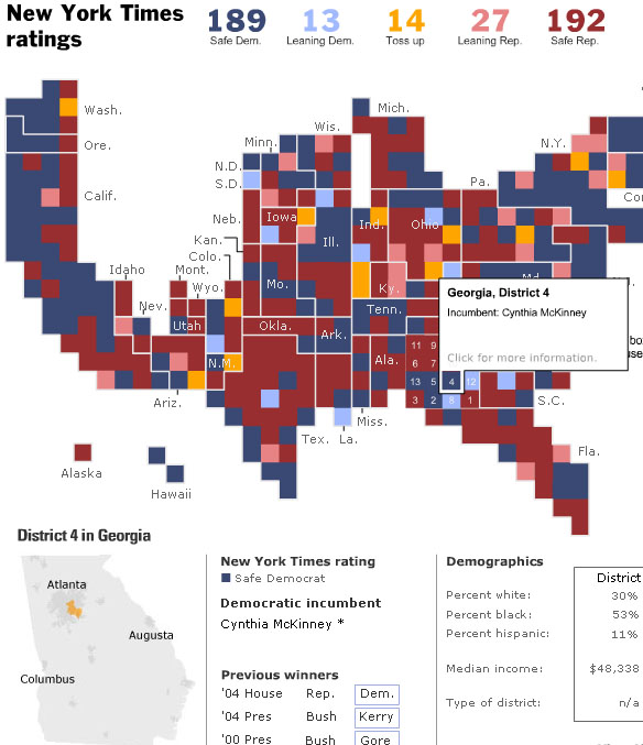
GA-04 is my district, previously held by Cynthia McKinney (D). However, the state Republicans heavily redistricted this district and McKinney lost badly in the primaries, and will not be returning to the House.* It's not likely to switch parties though as GA-04 is a strong (D).
The Washington Post also has an interactive election map:
Very similar in some ways to the NYT, but it takes a different approach in that less information is delivered on the map, but there's more linked textual information. If you click on a race it takes you away from the map to a text page which discusses the race and provides socio-economic data. But unlike the NYT map, you can't configure it to show those races where say the district voted for Bush but went with the Dem House candidate in urban areas... The NYT map is much more flexible and allows you cut the data in many ways. OTOH, the WaPo analysis is more up to date. NYT still hasn't got the August 8 primary winners up.
The winner here: The New York Times. Cartographers at the Post need to get back in the game.
*As of this writing, four incumbents are out (lost in primaries); 1 governor (AK), 1 Senator (CT), and 2 Reps (GA-04, MI-07).
![]()
No comments:
Post a Comment