4.29.2006

Satellite Imagery of Sprawl

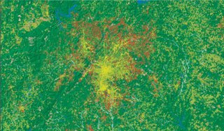
Coincidentally to my posts on population densities in the Southeast and in Atlanta, a new study has been announced using satellite imagery to measure urban sprawl:


Atlanta urban area, yellow = 1976, red = 1992)

The data are appreciably out of date unfortunately, especially for rapidly growing areas such as Atlanta, but still nevertheless provide an interesting perspective. The authors created a nationwide set of 30 square meter cells from the USGS National Land Cover data (mentioned below).

It should be easy enough to georeference this data even without the original files. There's also an interesting nationwide poster done on the Albers Equal Area projection with a nice shaded relief background.

Here is the actual paper.

(h/t to Cartography).

FBI Secretly Spied on 3,501 US Citizens in 2005

The AP reported today that the government secretly issued National Security Letters on 3,501 US citizens and legal residents to look at their bank, credit card, telephone and Internet companies in 2005.

Last year 9,254 NSLs were issued against 3,501 people but we don't know how many were issued in previous years. We only know this number because of reporting requirements in the Patriot Act, although there are possibly thousands of other letters unreported. I wrote about this last December, when the Washington Post revealed the fact that these letters are highly secret (no legal oversight) and if you get one you can't mention it to anyone else and of course seek legal advice:

The FBI security letters have been the subject of legal battles in two federal courts because, until the Patriot Act changes, recipients were barred from telling anyone about them.
Ann Beeson, the associate legal counsel for the American Civil Liberties Union, said the report to Congress "confirms our fear all along that National Security Letters are being used to get the records of thousands of innocent Americans without court approval."
So far only two organizations have challenged NSLs, both represented by the ACLU. Basically these are secret subpoenas sent to organizations for information about their clients or customers.

4.27.2006

Landscan and urban areas

(Updated below)


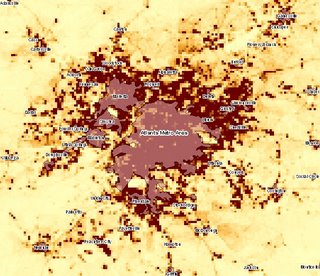
Here is a comparison of Landscan (again just pop count, needs to be corrected for pop density) and official "urban areas."

Obviously it matches up quite well but we'd need to see next how these urban areas were defined. The City of Atlanta, by the way, would be an even smaller area in the middle (I didn't include it for clarity but will put on a later posting).

Update: here it is:

More on Landscan

I said yesterday that Landscan and CIESIN incorporate additional (ancillary) population estimates. In many cases census data are too coarse a resolution (blocks in the US) or out of date. What data does Landscan incorporate?

Their most recent data is for 2004. It includes some high-resolution land cover data from the National Geospatial Intelligence Agency (NGA), administrative boundaries, and some satellite imagery I'm not familiar with (anyone? what is NGA's VMAP-1 or CIB), plus some actual imagery from the space shuttle on topography (SRTM) which is pretty cool. For more see here.

Other data include roads (TIGER in the US); slope angle (the Digital Terrain elevation [DTED] from the NGA predecessor, NIMA); land cover imagery in this case USGS Global Land Cover Characteristics (GLCC)--again I'm not familiar with this, if anybody has any info please leave in comments--is it any good, are there any better ones for the SE USA?

Also populated places (the VMAP data); nighttime lights; and census data being allocated to cells by a so-called "smart" interpolation routine (if roads are in the cell, allocate more population?).

Resolution is apparently 30" by 30" or about 1 square kilometer, hence much better than CIESIN which is 2.5' at best.

Now I need to know how to apply the density grid. There's no documentation on the Landscan site and emails to their office go unanswered.

4.26.2006

Characterizing Places with GIS

I plan to start a series of posts that attempt to characterize the US southeast and Atlanta in particular using GIS.

There are a number of reasons to do this, partly because I want to see how easy or difficult it is to do with GIS and what insights it affords.

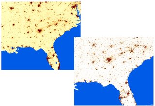
Obviously Census Bureau data will be very important, either from 2000 or updates via ACS. I've never used ACS so that is another reason to become more familiar with it. First up though, two non-census sources for population: Landscan (bottom right) and CIESIN (top left).


Both use supplemental data (lights at night etc.) to provide estimates of population. CIESIN data are at 2.5' (minutes) resolution.

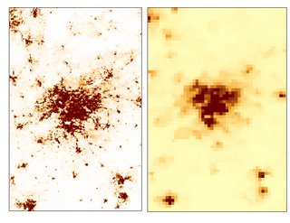
Here is a close up, both maps on the same scale (1:1,600,000):

Landscan on left and CIESIN on right. It would appear that Landscan is far superior, but the advantage of CIESIN is that it is downloadable as population density. I don't believe the Landscan is, rather it is population totals per unit area. Since unit area varies with latititude (though perhaps not much in the detailed view) this can throw things off. So, there is a correction factor you have to use, a density grid:


Update: If anyone can tell me how to apply this correcting grid, please let me know.

4.24.2006

What is a norg?

I've posted before about the apparent decline in news reporting standards--particularly the susceptibility of leading newspapers to become mere mouthpieces for the White House--below.

Rather than turn this into a fruitless "blogs vs. newspapers" however, a group of people from both sides of the aisle got together recently at the Annenberg School of Communications in Philadelphia (here and here). One of their ideas which bears further discussion is that both bloggers and newspapers should move beyond differences to see that they are both engaged in, if not news papers, then "news organizations" (norgs):

"I say this is the day that the war ends. This isn’t journalism against bloggers anymore. It never was, really. This is journalists and bloggers together in favor of news." (Jeff Jarvis)
and...
"Karl Martino comes up with the wiser metaphor for media’s world change. We always say that TV didn’t kill radio; ergo, newspapers must be safe. Karl, instead, sees this as LPs moving to CDs to MP3s. One m medium — paper — may, indeed, go away. “The music remains. The music doesn’t go away.”"
If you believe this, then you may see an analogy with mapping and cartography. When digital cartography became available to people in the 1980s there were two similar camps--the "new mappers" call them who thought that paper maps would either fade away or become less preferable, and the old school who rejected this technology.

But there's a third way, which is to grab hold of the opportunities of new technology, while understanding that digital interactive maps are just a new way of doing what cultures have been doing for thousands of years, namely understanding their world(s) spatially.

There's a big invested interest in (paper) newspapers. For the moment I don't see innovation coming out of the newspapers, instead I see defensiveness and ignorance about blogging (with exceptions of course). To many newspapers, blogging is a screaming morass of shrill rude people; perhaps a particualrly attractive meme to newspapers, but not one that will help them in the long run.

I'd be interested to see if this third option of "norgs" can get beyond the divide.