Cool New Map App
Following my post about the county level political data Morten Neilsen of "SharpGIS" has created a cool new mapping application to display the whole dataset (available from Anthony Robinson at Penn State).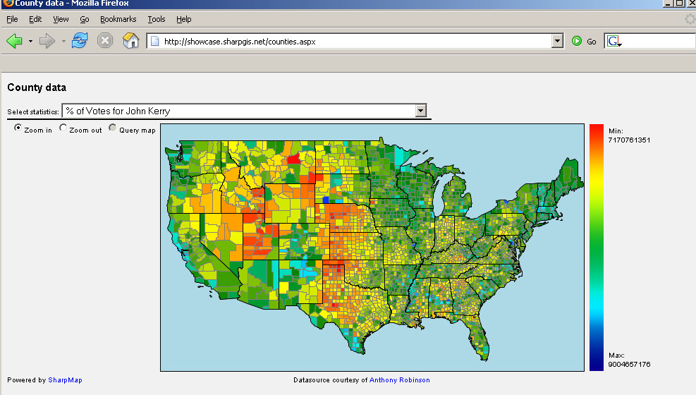
Morten uses a double-ended color ramp which I'm not sure would pass muster in design textbooks, but that aside, it's a good example of what can be done when raw data are shared. Using his web app you can pull down and instantly display any of the data sets that Penn State makes available. I wasn't previously aware of the application SharpMap he uses but I was impressed by how quickly something can be created with it. Thanks!
Another correspondent also left a note about the FairData site which takes a slightly different approach. They have tons of data and provide an interactive map interface to it (ie they handle the mapping and the data rather than distributing the data for people to play with). This has the advantage of providing users with maps without having to learn map software. They appear to use Maptitude for the Web, which I found a bit clunky. Specifically the Info button doesn't work in Firefox (which they acknowledge).
These kinds of web-distributed political efforts have a real potential to help precision-mapping of get out the vote (GOTV) and voter registration efforts. They may even help people become more interested in politics since these tools (previously only available to precinct captains and activists) are now available to all.
![]()
1 comment:
For those who are interested, more information can be found on the Maptitude mapping software at www.caliper.com.
Post a Comment