8.19.2006

Yale library dispute

Ed Dahl (who should know) takes offense at the story cited below that the Yale map library "languished" after the "dollar a year" man (love that phrase) retired. Dahl defends Barbara McCorkle's work at the library in a post on map-hist:

EXCUSE ME!, as they say.
Vietor may well have been a wonderful collector, passionate about maps and wealthy enough to afford to buy them for the map collection. Much of the value of the Yale collection was directly due to his efforts. But he was not an administrator, and the collection was badly in need of attention when Barbara McCorkle arrived -- one of the reasons she was hired. Those of us who visited her at that collection know that the place certainly did not "languish" after her arrival, but was rehoused, put in usable condition, and was much used. Her thirteen years there are misrepresented by Ms. Martineau's article.
Other people add that McCorkle was tied to the help desk and wasn't able to devote enough attention to the collection.

I've only visited Yale once and not the map library so I can't say, but I've heard McCorkle's name enough times to feel she is well respected. Why would the paper make the assertion that the library languished though if they hadn't heard that from someone there--maybe it's a move by the library administrator to push for more funds?

8.18.2006

Did we evolve?

The NYT reports on a new survey of opinions about evolution with an amusing headline:

"Did humans evolve? Not us, say Americans"

(Original article in Science).


These surveys tend to reflect the same findings as the ones that find Americans way down the list of geographical knowledge.

In his book What it means to be 98% chimpanzee, Jonathan Marks offers an interesting explanation for these kind of findings. He says that it's not surprising when you present evolution as soulless and ridden with fatalistic overtones ("we are our genes"). Interesting for an anthropologist, anyway. By contrast the authors of this study argue that it's Americans own fault: the rise of fundamentalism and the politicization of science are their causes.

These two different interpretations suggest two very different solutions. Marks: scientists (esp. geneticists), get over yourselves! Science: Americans, become more secular and believe that science occurs without politics!

The scientist says: "Science has explained many things about the universe. Your life has no meaning. Have a nice day." And then he is surprised and appalled at the public rejection of that philosophy. (Marks, p. 283).
Support for Marks might come from the fact that the only country below the USA is Turkey, presumably because of Islamic fundamentalism. Also, Marks will no doubt groan at the interpretation of the scientists.

However, many of the other countries on the list above the USA presumably also hear the soulless-fatal view of science and they haven't rejected evolution.

Marks suggests that a better approach against the aggressiveness of science is to teach people "a humanistic, anthropological approach to science...to present science not so much as the one true answer in opposition to the many false ones (which has a famuiliar evangelical ring to it) but as an answer constructed within a particular cultural framework" (284-5).

Mapping the polls

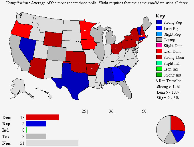
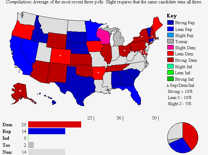
Can polls predict electoral outcomes? Take a look at these maps:


Gubernatorial polls as of May 30, 2006


Polls as of Mid-August, 2008

On these maps red = Democratic, blue = Republican. 14 Republican seats are up for election, 13 Democratic and 9 open (1 was Democratic, 8 Republican). The current totals are 22 D, 28 R

Comparing the most recent situation to the one 3 months ago shows a trend toward the Democratic Party--instead of 5 pickups, they show 7 pickups (MD and CO have been added, along with AK, while MN has been taken away. AK may switch around however, depending on who runs).

How accurate will these polls be? A 3-poll moving average is obviously less sensitive to minor fluctuations, and supposedly reflect the deeper underlying feelings in the country. But the supposed "terror bump" that Bush was supposed to pickup after the London terrorist plot last week has not occurred either, so it may be that the electorate is not reacting to news any more, but slowly drifting in its opinions further toward the Democrats.

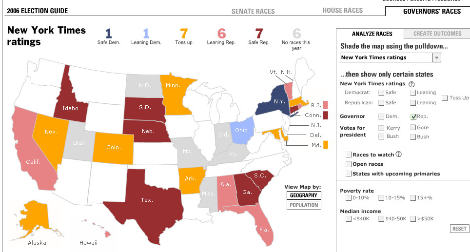
On the other hand, the NYT has a different scenario. Here's their map of Republican seats (incumbent or open), showing 2 pickups for Dems and 7 toss-ups:

However most of their toss-ups are really D gains or holds (eg., MA, where the latest polls puts Dems ahead by 10 points).

But the NYT site is good to mess around with to show different scenarios.

Eg., show me all the states with a median income over $50k.

However, I wish they would have a different criteria for "toss-up" as I don't think most of them really are.

8.17.2006

Judge: Bush's warrantless wiretapping program is unconstitutional

Extraordinary news:

A federal judge ruled Thursday that the government's warrantless wiretapping program is unconstitutional and ordered an immediate halt to it.

U.S. District Judge Anna Diggs Taylor in Detroit became the first judge to strike down the National Security Agency's program, which she says violates the rights to free speech and privacy as well as the separation of powers enshrined in the Constitution.

No doubt this will be appealed, but you know it is not that long ago that the Bush administration claimed that even reporting on this practice was aiding and abetting terrorism. Guess they've got some 'splainin to do.

Glenn Greenwald, as usual, has the scoop.

Note his comment that the opinion does not rule on the constitutionality of data-mining, on the grounds that it has not been publicly confirmed (Bush confirmed the existence of the warrantless wiretapping program himself). This is disappointing. Data-mining is an incredibly invasive means of surveillance because it sifts through everybody's data, whether guilty or not, in order to find the guilty. This takes time and resources, and subjects the vast, vast majority of innocent people to scrutiny at the expense of the 1 in a million who are possibly guilty, as well as giving rise to "false positives."

John Allen Paulos, a mathematician at Temple University explains:
Even if the probability that the purported terrorist profile is accurate were an astonishing 99 percent (if someone has terrorist ties, the profile will pick him or her out 99 percent of the time, and, for ease of computation, if someone does not have such ties, the profile will pick him or her out only 1 percent of the time), most of the hits would be false positives.
For illustration, let's further assume that one out of a million American residents has terrorist ties — that's approximately 300 people — and the profile will pick out 99 percent, or 297 of them. Great. But what of the approximately 300 million innocent Americans? The profile will also pick out 1 percent of them, “only” 3 million false positives, innocent people who will be caught up in a Kafkaesque dragnet.

How many planets are there?

This post at the ever-stimulating Atlas(t) prompts the question: how many planets are there?

An easy question, right? After all, I think we should be able to tell if we bump into a planet! They're pretty big.

So is Pluto one? A planet that is. This illustrates an interesting question because while it might appear straightforward (Pluto either is or isn't a planet) it shows that what we know is actually dependent on our categories for things. Kant said this way back. He said that while we have no direct knowledge of the real world, what we do have is knowledge of our categories for things (try thinking without any categories--it's not possible).

So "planet" is not a natural object, it's a human category. And as the category changes or is challenged, some things may no longer belong to it. Mapping of course is another activity where we don't just take the world, but put it into categories. The trick is to know what categories are operating at any given time.

Bottom line: we may have just lost a planet!

Big gift to Yale University map library

This is good:

A rare books dealer who has been using Yale University's map collection since his undergraduate days has pledged to give his alma mater $100,000 to help bring the massive collection into the modern era.
Furthermore, Yale will match the gift. Apparently the collection was managed by a "dollar a year" man (basically a volunteer). The head librarian today, Alice Prochaska, said the library hopes now to endow a map curator position.

8.16.2006

The geography of terror

OK, first we have "the axis of evil" (David Frum via George Bush)

Then it was the "outposts of tyranny" (Condi)

Now we have the "central front of the war on terror."

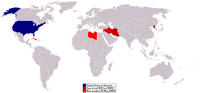
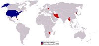
These are all very geographical and I got to wondering if it was even possible to map these out. Sure enough, someone has done so.


Axis of evil (and beyond)--Wikipedia


Outposts of tyranny


There isn't one yet for the "central front" so the location of that is unknown. We don't normally think of the "war on terror" as having traditional fronts and coherent geographical locations so these characterizations are more than metaphors, they're part of a new map of the world.

These geographical put-downs reveal a highly geocentric perspective. An outpost, after all, is something that is far away from you, as well as out of the mainstream. On the map above, you can see the outposts are far away... from the USA (although some are perilously close to Britain supposedly the US's strongest ally on the WOT!).

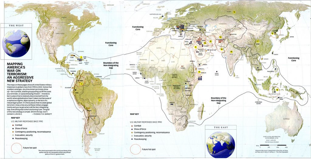
Probably the most explicit new map from this perspective is the one in Barnett's book The Pentagon's New Map:


(Map by William McNulty)

As you can see if you click through to the web site or the bigger image, Barnett characterizes the world into two zones; the good or the "functioning core" and the bad or the "Non-integrating gap." This is an update on Mackinder, or Mackinder-lite you could say, and reflects the old core-periphery models of high school geography in the 1950s cold war.

Barnett is triste on the cold war; he misses it. The cold war provided a vision for the USA, one we don't have today (well, that's true!). If you examine the map you see that there is a simple logic at work; that of western-style globalization. Any country that doesn't align with this capitalist mode of production is out of it (non-integrating). If you thought Tom Friedman was keen on globalization, wait till you see what this guy says--never mind that globalization hasn't worked even in the "core" or in places such as Iraq where Barnett's military superiors are warning of civil war.

If you take the core-periphery model (and Barnett needs a new map because his non-integrating gap is visually in the core; perhaps an oblique projection would fix it?) as it was developed in the 1960s (eg., by J. Friedmann) it was part of a series of stages that led to complete spatial integration. Barnett has dusted off these old geopolitical ideas and given them a new look for the 21st century. For example, what is to say that the "core" needs a periphery in order to sustain itself and exploit disparities in income (outsourcing or immigration as labor)? What we have observed is actually an increase in the concentration of power and wealth in the "core" rather than a decrease.


"There is always a well-known solution to every human problem - neat, plausible, and wrong"
H.L. Mencken "The Divine Afflatus", in Prejudices: Second Series p.158

8.15.2006

OK, what does "geospatial" mean?

We all use the word, but what--exactly--does "geospatial" mean?

It's kind of an odd word anyway, surely "geo" and "spatial" refer to the same thing, namely, well space and geography. Can you have a geo-geography? How about a non-geo spatial? What's the difference between regular spatial and geospatial?

Is it an industry word? People in academia don't seem to use it.

Glenn at anything geospatial says he's been doing geospatial and GIS for 15 years, but I thought the word was only a few years old. What's the difference between GIS and geospatial then?

Is it a good word? Should we promote it? Should we replace "GIS" with "geospatial" when we speak to other people?

What does it mean?

Targeting immigrants

Today seems to be national immigrant day, according to all the news stories around that discuss the new Census ACS release. The Census Bureau released a new set of data as part of its ongoing
American Community Survey. A lot of stories focus on the growth of immigration however.

Here are the memes:

1. They're here and they're growing fast

2. They're in the suburbs

3. OK, they bring some economic benefits

Notice anything? Yes, it's "us" and "them" again, or even "us" and different thems (divide and conquer baby!). Here's a local paper's take:

Few people need official numbers to tell them a dramatic demographic shift is under way from Lilburn to Lawrenceville and Duluth to Dacula. Gwinnett is now 19 percent black, 16 percent Hispanic and 10 percent Asian.

Non-Hispanic whites, 90 percent of the population in 1990, accounted for 54 percent in 2005. Their raw numbers dropped for the second straight year, even as the county's overall population jumped by more than 25,000.

This is one reason why people are opposed to collecting data by race!

See Targeting Immigrants by Jonathan Xavier.

GIS in the classroom

Does GIS belong in the classroom? If so, how should it be taught?

I was thinking about this because of the news item in the Vancouver Sun about Nick Hedley's class which uses "augmented reality" tools:

As a specialist in geographic visualization and spatial cognition, Hedley developed an augmented reality tool designed to give students the ability to test their hypotheses and interact with the geography they're studying in a virtual environment.

The tool superimposes rendered images of three-dimensional graphics onto a view of the real world shown on a screen.

This sounds way beyond anything I had in the classroom and a lot of fun to boot.

Educators know though that learning should be more than fun. This new book, Learning to Think Spatially makes the case that geospatial learning revolves around 3 things: concepts of space (spatial data models I guess would be a GIS equivalent), spatial representation (maps and GIS); and spatial reasoning.

Here's the executive summary.

8.14.2006

History of race mapping

Do we have any good histories of race mapping?

Such a history should cover the attempts to map out races such as we see in the 19th century, and at first sight we'd be limited to that time period when the modern meaning of race was in use (in the west); that is, as a small number of natural groups occurring over large, continental territories, since say the 18th century.

On the other hand, it is worth including the early encounter maps produced by Europeans during the 15th and 16th centuries, which effectively mapped (or pictured around the margins anyway) indigenous peoples. That's more indirect and would shade into mappings that attempted to claim territories within Europe, or the Monarchs, Ministers and Maps stuff.

Also you'd want to show how even in 19th-20th century Europe and America that smaller groups of people within a continent could be mapped (for example, by language) and to what extent this was race-based. Today we certainly map populations of one sort or another but the distinction would be whether the claim is that these show natural groupings (ie., race is innate in the peoples) or are a human construct done for convenience, one of many such groupings.

Are we nature with a layer of culture, or culture all the way through?

Having finished Jonathan Marks' book (see previous post), it's clear that he strongly advocates a science that can deal with its social implications as a form of knowledge. Any science--or scientist (including presumably GIScientists) that tries to confine itself to purely technical issues will not only come a cropper, but will miss the most pertinent aspects of their work.

For example, he says he is sometimes asked by students in his class "whether a human could successfully mate with a chimpanzee?" He says one can take a variety of responses to this (ethical, technical, even humor) but the one he prefers is to ask: assuming we could, what would we do with the baby? Would it be raised as a human or a chimp? How would you protect it/him/her from the spotlight of publicity? Would you send it/him/her to school? What are your responsibilities to that baby?

His point is that: "'Could it be done' is not simply a biochemical question, it is a social and ethical question." And today's scientists have to incorporate that thinking in their work--it's truly part of science.

As an extension of this observation he articulates an understanding of humans as cultural and he rejects attempts to deal with a substrate of purely "natural" qualities. These have historically occurred for example in the idea of the "noble savage" who was closer to nature than "we" are, or the great chain of being where different races were given different evolutionary hierarchies (that is, some "less" evolved). We reject these now, he says, but have instead replaced it with another being who supposedly is "man minus culture;" namely the chimpanzee.

The other view you sometimes see articulated is that we are "natural" creatures with an overlay of culture. This comes up a lot and was widely popularized in the 1990s by Camille Paglia's book Sexual Personae (1990) in which she argued for this position. It also comes up sometimes even among well-meaning anthropologists who want to separate race into a (now rejected) genetic component and a socio-cultural or political component. People confuse the two, they say. Yes but we have to be careful here. Biology or a gene by itself has no meaning, but when we study it we do so in a system of meaning (science). If you look for a gene for something (left-handedness, say) you might find one, but that doesn't explain the meaning of left-handedness eg., what to do about it. Genetics certainly has a cultural component in this sense.

This is what his book is about. He says that just because we share say 98% of our genes with chimps doesn't mean that we are chimps. We share about 40% of our genes with fish, but that doesn't make us fish-like. And so it's wrong to think of chimpanzees as "like us, only without the culture." Culture is about using symbolic systems in a widespread way.

Systems such as language and maps.

So a study of maps without the culture is not really a study at all, certainly not a good study.

8.13.2006

The map communication model and critical cartography

(Updated)

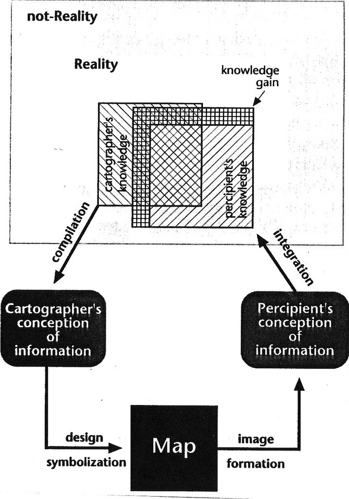
The theory that prevailed in cartography until the advent of critical cartography was known as the "map communication model" (MCM). Actually it still persists as a kind of naive folk wisdom today. I say naive because it is accepted as an unexamined assumption, particularly among GIS practitioners and some cartographers. Here's the basic outline as it was prevalent in the 1960s and 70s:


This diagram, taken from Alan MacEachren's 1995 book How Maps Work derives from his earlier work in cartography, which endorsed the MCM. MacEachren, known today for his work on geovisualization, admits in the book that he now rejects the MCM, and goes on to explain his about-face (and his embrace of geovisualization).

The MCM is a processual model that characterizes mapping as a process of transmitting information (geographic information) via the map from the cartographer to the end-user. In order to see what's wrong with that, we have to first make a distinction between information and knowledge. Information is data that lets you make a decision, and since Claude Shannon's classic work on information theory in the 1930s we can define the lowest possible unit of information as two binary digits (0, 1) or bits. For example, if you're waiting in the gas chamber to hear from the governor whether to execute the prisoner, the phone can ring with a "yes" or "no" message. That's information.

This insight allows us to measure information and compare how much information was successfully transmitted via the map. So the focus is information and its transmission, and it lead to a whole subdiscipline of studies that investigate how well maps are communicating their information.

This work was doomed to eventual failure however because unlike computers we don't live in a world of information, we live in a world of knowledge. Knowledge here can be defined as information that has been interpreted in a meaningful way, usually using theory-based assumptions (that is, "categories"). And the map communication model cannot provide any account of knowledge.

Update: Why not? Because knowledge is information in a cultural context. What is a meaningful information signal to one person is meaningless to another. The Greeks, for all their knowledge couldn't understand what foreigners were saying--it was all just "bar, bar, bar." So of course they called them "barbarians." The MCM doesn't account for this context-dependent meaning of information, so to ask generations of college students if they received the information transmission of the map was always going to fail. What was needed was an understanding of maps and mapping in a cultural context.

The second issue problem with the MCM is that it posits a clear distinction between the cartographer and the end-user with the cartographer the source of information. Today we understand that mapping is increasingly done by the user (as in map mashups), especially in thematic data or analytical-GIS contexts. Location maps and atlases however may still be somewhat accurately described as being produced by a professional cadre of cartographers. For example, the maps in your GPS are often extensively road tested by the company.

By far the most interesting work done in cartography however, probably since the great age of surveying ended in the late 18th and 19th centuries, has been thematic. Even many locational maps (say an environmental map of Canada) has thematic purposes. Thematic mapping really took off in the 19th century, although you can find some examples prior to that.

Critical cartography is the investigation of map use from the perspective of maps, knowledge and their socio-political contexts. It often invokes "social theory" in order to examine the categories of knowledge (such as race, territory, boundaries, or identity) that are produced or reproduced by maps. This is a much richer and more satisfying account of mapping than the MCM, and it is also in my opinion a much more accurate one.

Today the MCM can only be considered a relic of a previous time, a kind of evolutionary dead-end of knowledge. Either that or the MCM will come to be incorporated into some much richer account. We now know that maps really don't work like this, as MacEachren recognized in 1995. Critical cartography is emerging as the strongest contender but has yet to prove itself a coherent theory (and its proponents often explicitly reject the idea of a coherent theory so it may never have one) or a definitive set of new practices. This is due more to a surfeit of ideas and approaches than a lack of them however. And at the least we can say that all critical cartography shares a broad acceptance of the politics of mapping; that is, that mapping is a political act or has political outcomes.

8.12.2006

Race and maps

I'm reading What it means to be 98% chimpanzee, by the anthropologist Jonathan Marks, who I met earlier this year at a symposium (he signed my book "100% human"!). Marks is an authority on race and genetics and his recent work has covered the intellectual history of race as a cultural construct.

In the book Marks compares the different approaches taken by Linnaeus and the comte de Buffon on the question of classification of species. Linnaeus favored a hierarchical structure of species--genera--orders--classes (or families). Now all life could be placed within this structure. Linnaeus had three special cases where he subdivided species into subspecies and humans were one of these (the others were dogs and sheep, showing perhaps what breeds were important in the 17th century!).

Buffon however spoke in a very different way. He rejected the classification of nature into units and instead emphasized its continually varying diversity. Where Linnaeus saw difference and discrete boun daries, Buffon saw continuity and variation.

Aha! This is like the two major approaches to mapping thematic data, one based on discrete boundaries and the other on continuity. In other words, like the choropleth map and the isopleth map. The two naturalists are emblematic of the way that we approach our problems today. While Linnaeus didn't use the term "race" for his subspecies, later scholars did, and it was around this time that the modern concept of race as a small group of well-defined peoples was invented. The parallel concept of the choropleth was not invented until the early 19th century (1826 to be precise). The conjunction of these concepts (race and discrete geographical units or race mapping) also came to prominance in the 19th century.

The trouble with both the Linnaean system and choropleth maps (despite the fact that they are both very popular) is that they take a continually varying phenomenon and apply a category over the top of it.

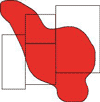
Take this cancer cluster for example (shown in red):


If we see this cancer through the grid of a choropleth map, say using counties (gray lines) we would likely conclude that 3 of the 4 counties have a high cancer risk and 1 of them has a negligible risk. We would be justified in making this conclusion and yet it is misleading. Even in those 3 high risk counties the risk is not everywhere and yet no doubt the public health message would be that people in those counties are at risk, when clearly many are not. Also even in the county with negligible risk (on the left) there are some people who are at risk and yet no doubt again the public health message would be based on the county as a whole (because that is what our data would show in the choropleth map).

This is analogous to the fallacy of race-based medicine, by the way (eg., sickle cell anemia) where the message goes out that blacks are at risk from it. Well no, it's got nothing to do with race, it depends on your hereditary exposure to malaria. Many light-skinned African peoples in North Africa, and others around the Mediterranean are also at higher risk from it. And of course not all blacks are at risk from it. Yet this becomes a "black" disease, unnecessarily worrying many people and not worrying others enough.

Marks also offers an interesting insight into why we are "mammals" which I hadn't heard before. On what basis did Linnaeus choose the mammae as his defining criterion? Mammals have lots of features that distinguish them from other species, including hair and the fact that we only have one bone in the lower jaw. Why didn't he choose those? It turns out that in the 17th century there was a controversy over breast-feeding. Many richer families were sending out their newborns to wetnurses. Linnaeus was an active opponenet of this and he called us mammals to underline the fact that we should be breast-feeding our own young. (Marks credits Schiebinger's book Nature's Body for this account.)

So the lesson is that while we use categories to order things these very categories are constructs to help us order the world and do not exist in nature itself. This can lead to insights--or equally to mistakes and obfuscations when we believe the categories are natural. This goes both for race and for the choropleth map.

Philip K. Dick and drugs (again)

Today's article in The Guardian by Philip Purser-Hallard about Philip K. Dick's drug use repeats the myth that Dick was a consistent and avid consumer of drugs, and that this is the key to his success as a writer:

Many of Dick's writings contain such pharmaceutical themes, with their protagonists (usually cops) suffering catastrophic changes in perception, often brought about by exotic substances. These "reality shifts" generally lead to an understanding of the true nature of the universe - an effect that Dick, whose drug intake was as prolific as his fiction output, believed he had experienced personally...
His writing had always been fuelled by vast quantities of amphetamines, but he soon branched out into marijuana, mescaline, LSD, sodium pentothal and even PCP...
Dick's relationship with drugs is far more complex than Purser-Hallard suggests. By highlighting, even glorifying, the drug use it gives the impression that Dick's life was primarily oriented around drugs, and rather cheekily suggests that his fiction was inspired by drugs.

What's funny is that this is a comment on Dick's most moving work, an anti-drug novel, A Scanner Darkly. This book, published in 1977 is often cited as a turning point in Dick's relationship with drugs. It's a pretty dark book, about how a drug (Substance D for death) can fry your brains.

According to his biographers, Dick's main drug was speed or uppers, which he started using early in his career to produce enough wordage to support himself (early sci-fi magazines in the 50s and 60s paid by the word). By the 1970s he had had enough of drug use and often volunteered at anti-drug meetings and talks to youth groups. Writing to the county drug abuse program in late 1972--five years before the publication of A Scanner Darkly, Dick said:
Street drugs--especially heroin--are the most serious problem in this country, and perhaps the world, today (source)
"Heroin was one drug Dick never did mess with" according to Lawrence Sutin, his biographer (p. 192). "Never again did Phil take speed on a regular basis" (p. 194).

Dick also wrote to his former doctor that Fall that since his treatment in a Canadian drug clinic he was "without any chemicals; I take no legal drugs either, no tranquilizers or anything. We don't even have an aspirin in the apartment" (Letters of Philip K. Dick 1972-73, pp. 67-8). A Scanner Darkly was written during late 1972 and 1973, exactly at the time then when he was clear of drugs, and as far as I know never again seriously did drugs. In fact his most stunning and visionary work such as VALIS, The Divine Invasion, his Exegesis etc. in other words all the 2/3-1974 stuff, occurred after his rehabilitation at X-Kalay. Well OK, there was one drug that he took in large quantities--snuff.

Reducing the story of Dick's work and life to drugs is I think just lazy and facile. There's more than enough of interest in the work itself to keep people busy.

Scanner Darkly (the film) is now going into wide release. It's a fairly close adaptation of the novel but suffers from the rotoscoping technique somewhat, but more importantly manages to dilute the impact by concentrating too much on stoner-hippie yucks (Woody Harrelson is particularly guilty here, and Keanu Reeves' laid back style is infused with it). A lot of this is played for straight laughs where Dick played it for dark comedic perspective on how drugs fry your brain--the number of gears on the bike scene for example.

It's this scene which in the book first alerts the authorities that the protagonist, Bob Arctor, is in cognitive trouble, because he's there and can't figure out the gears either. In the book they all traipse outside and ask the first person they meet--a 17-year guy--where the "missing" gears are, and he calmly explains it to them. The contrast between the young man "driving an incredibly beat-up old transportation-type car" and the group is written by Dick as a sad commentary on their confusion and child-like intelligence:
"None of you could look at the bike and perceive the simple mathematical operation involved in determining the number of its very small system of gear ratios." In the deputy's voice Fred heard a certain compassion, a measure of being kind. "An operation like that constitutes a junior high school aptitude test. Were you all stoned?"
"No," Fred said.
The other key scene in the book is where Arctor wakes up and sees his one-night stand morph into his girfriend, Donna. The fact that this is recorded on tape and later viewed by Fred (his alter ego) shows something deeply troubling that raises all kinds of Dickian possibilities. It's not just Arctor having a drug episode because the morph (and here the rotoscoping does come into good effect) can be viewed by Fred the cop persona. But is therefore Fred also under the influence? Or did somehow reality change in some way? To reveal some deeper reality?

Dick says in an afterword that the book has no moral: "it does not say they were wrong to play when they should have toiled; it just tells what the consequences were." But it's clear the price is too high:
In this particular life-style the motto is 'Be happy now because tomorrow you are dying,' but the dying begins almost at once, and the happiness is a memory.

8.11.2006

Poll: Bush at new low


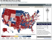
CQPolitics map

There was a lot of prognostication (particularly from the Republicans) following the Lamont victory in CT that this spelled trouble for Democrats in the forthcoming midterms. The idea was supposedly that there are "leftist" elements in the Democratic party (not "
Democrat Party" as Republicans like to slur) which pushed/manufactured this win, which are therefore of course out of step with the country as a whole. Unfortunately for this line of reasoning it falls down in two main ways: 1. The voters of CT behind the Lamont win were pretty widespread throughout the state and not an elite urban core, and in this they are in step with most Americans--62% of whom disapprove of the way Bush is handling Iraq, and 71% of whom think the country is heading in the wrong direction; 2. The clear majority of Americans (by 2 to 1) disapprove of Bush in a new AP poll, and a Fox News poll shows Dems with the largest lead since 1982 in the House.

An Associated Press-Ipsos poll conducted this week found the president's approval rating has dropped to 33 percent, matching his low in May. His handling of nearly every issue, from the Iraq war to foreign policy, contributed to the president's decline around the nation, even in the Republican-friendly South (AP).
Those are the only two possible bases for the Republican argument, but reality pretty much destroys it.

In fact, the Center for Politics recently updated its overall assessment to predict that Democrats will pick up 12-15 House seats (15 needed), 3-6 Senate seats (6 needed) and 4-6 governorships. CQPolitics meanwhile also reassess favorably for Democrats and their prediction map is shown above.

8.10.2006

More on GOTV and micro-politics


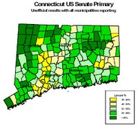
Following the Lamont victory in Connecticut on Tuesday, there has been some analysis of the different characteristics of the places that favored either Lamont or Lieberman.

The report shows that Lamont's support was not geographically isolated, but spread throughout the state. The map is not really "micro-politics" in the sense I've used it previously (precinct level or very fine geographies if done by raster) but the analysts expect to do that level of analysis later.

Places that went for Lamont:

• Rural areas
• Areas with a high median household income
• Areas with a high housing value
• Areas with a higher percentage of voters with college degrees or graduate degrees
• Areas with a high percentage of owner-occupied housing
• Areas with a high percentage of married couples
• Areas with a high percentage of children in private schools
• Areas with low turnover in housing
• Areas with high percentage in white-collar occupations
• Areas where many voters have long commute times
• Areas with high concentrations of veterans

Places that went for Liberman:

• Urban areas
• Areas with high numbers of single women
• Areas with high numbers of unmarried partners, including same-sex partners
• Areas with a high percentage of renter-occupied housing
• Areas with a high property tax burden
• Areas with a high percentage of voters working in blue-collar occupations
• Areas with a high percentage of voters working in service sector occupations
• Areas with a high concentration of people receiving social security
• Areas with high concentrations of individuals currently serving in the armed forces


This kind of analysis is tricky because you may be confounding variables; eg., Lamont did well in rural areas, rural areas are where agricultural workers are, but agricultural workers may or may not be significantly on Lamont's side. Similarly with gay voters and urban areas (gays are predominantly in urban areas). There is more than a whiff of the ecological fallacy in this stuff.

Here's a company that does a geographical text search


Here's a company that does a geographical text search and displays the results on an interactive map: Metacartography. I hadn't heard of them before, but they sound like a recent startup. As usual with these things the people involved have little or no formal cartographic/GIS training, but rather stumbled upon geographic visualization. Here's the blurb about the founder:

John founded MetaCarta in 1999 while beginning work on his Ph.D. in physics as a Hertz Fellow at the Massachusetts Institute of Technology. While studying the microclimates of forests, John encountered a need for a new way to view collections of documents: geographically.
Well, geography isn't exactly new, but whatever. Here's what they do--their software "ingests" a ton of different kinds of documents (including web pages and Word docs) and finds all the geographic references (explicit and somehow implied) and then tags them with a locational reference. These can then be produced on an interactive map. So presumably (I haven't played with it) if you type your city name in or perhaps even your street name you could find all the documents that refer to it; maybe even an obscure planning permission from the basement of city hall).

This is another step toward the vision in Mapping Hacks:
Imagine a world in which we can move about physical places, accessing not only what is stored in our brains but also multiple layers of information that have previously been inaccessible: experiences of friends, colleagues and complete strangers in the same space; information about who lives and works in the place...perhaps their political affiliations; crime statistics, the history of community events...This is precisely the physical landscape we will likely inhabit in 10 years"

"The physical landscape we move in will become "deep" with vast amounts of digital information--in text, images, and other sensory forms"

Mapping Hacks, Schuyler Erle, p. xxii, 2005.

Erle will be Guest of Honor at this year's NACIS conference, October 2006.

New online GIS of medieval towns


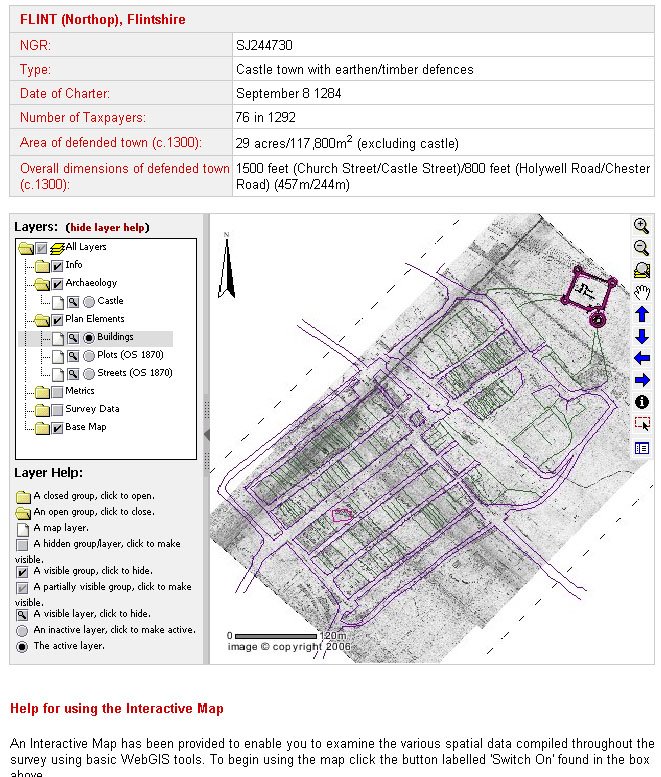
A team at Queen's University, Belfast has released an online GIS of several medieval towns based on archaeological fieldwork:

Using mapping as a medium, the project examined how urban landscapes were shaped in the middle ages, the project furthers an understanding of the forms and formation of medieval towns. It is the first project to have used spatial technologies – Geographical Information Systems (GIS) and Global Positioning Systems (GPS) – as a basis for mapping and analysing medieval urban landscapes...

The project focused on a group of ‘new towns’ situated in Wales and England and established in the reign of King Edward I. The towns were all founded between 1277 and 1303. The project looked at thirteen of them in detail: Aberystwyth, Beaumaris, Caernarfon, Caerwys, Conwy, Cricieth, Flint, Harlech, Holt, Newborough, Overton, Rhuddlan, and Winchelsea.
This project combines several of my favorite things, including the overlaying of historic maps in GIS (a la the David Rumsey site) and the characterization of urban areas in terms of its population. You can also download historic data files in shapefile format for offline analysis.

Via the History of Geography listserv

8.09.2006

the end of cartographic information or just the beginning?

OK, here's something that confuses me.

There are two grand theories out there right now that relate to maps and cartographic information. You've heard of both of them, but I've never seen them compared. They promise almost exactly opposite results.

The first and most trendy is the so-called "long tail" of information. Adena's recent article summarizes it well:

The "long tail" coined by Chris Anderson (editor of Wired, who followed up with an article in that publication recently and published a book by that name this week, which was referenced in The New York Times) refers to the phenomenon whereby there's lots of demand for a few popular products (movies, books, albums/songs) and hence they produce a lot of revenue for companies (NetFlix, Amazon, iTunes), but there's little demand for lots of other similar products. For example, many people are going to want to rent Stephen Spielberg's Munich (like my brother and my parents and others), but only a few will want to rent Running on the Sun, about a long race through the desert (like me and other crazies who think that's interesting/fun).

So, Blockbuster will make a lot from Munich and other "blockbusters." It'll make less from Running on the Sun, but… and this is the key thing… it doesn't cost Blockbuster (NetFlix, Amazon, fill in your favorite Business 2.0 company here) that much to stock those films that are in "less demand." In fact, by making available all of those "long tail" films for a long time and serving them to the few who want to see them, it can make a pretty penny.
(Actually the key idea here isn't so new; it was invented by the economist Pareto in 1906, you can read about him in Wikipedia here. His principle is more commonly known as the 80:20 rule or the Pareto law.)

On the other hand we have an even more trendy idea known as "globalization." As it relates to maps and mapping, globalization will reduce the choices that we have through corporate integration, the replacement of smaller, diverse stores with gloobally international ones, and the homogenization of world culture. This was recently discussed in the context of WalMart in last month's Harper's (available online here). The author, Barry C. Lynn, argues that Walmart is a latter-day Standard Oil. A staggering 1 in 5 of every retail purchase in America is done at a Walmart's, and they delibaretely and successfully reduce choice:
The idea that Wal-Mart's power actually subverts the functioning of the free market will seem shocking to some. After all, the firm rose to dominance in the same way that many thousands of other companies before it did -- through smart innovation, a unique culture, and a focus on serving the customer. Even a decade ago, Americans could fairly conclude that, in most respects, Wal-Mart's rise had been good for the nation. But the issue before us is not how Wal-Mart grew to scale but how Wal-Mart uses its power today and will use it tomorrow. The problem is that Wal-Mart, like other monopsonists, does not participate in the market so much as use its power to micromanage the market, carefully coordinating the actions of thousands of firms from a position above the market.
So on the one hand the long tail will provide us with tons of choice and different types of maps, and mappings, while on the other globalization will do exactly the opposite. Which is the real story here?

Brian Harley and the Middle East map

An interesting article from Zaman Online, a Turkish news source discusses the influence of Harley's work in the context of the Middle East, specifically Turkey and the Kurds.

According to the new global imperial regime, the Middle East map will be defined once again; geographies will be erased and cut out again, and borders will shift in accordance with certain objectives. Just as at Brest-Litovsk, just as at Sevres, and just as at Versailles and Yalta, the maps on our desks will quickly be tossed into the wastepaper basket. In other words, once again the maps aren’t real; they will show what the boss wants. The jolting insight of the indefatigable map decipherer of our age, J. B. Harley, comes to mind: “The history of the use of maps shows us that they never show the truth; they only serve to produce a different truth”...

Today the name of the workshop where the draft is feverishly being made is just under our nose – the “Great Middle East Project.” First we learned its name from the American press, and then we heard statements from Prime Minister Recep Tayyip Erdogan that they wanted to make Diyarbakir the center of this project, and we gave credit to Harley one more time. The map-makers have got to work. Who could have prevented it? The Middle East map grows and shrinks; countries, peoples, and cultures enter and exit.
See also here.

8.03.2006

Armin Lobeck (1886-1958)


NARA April 06 032
Originally uploaded by ubikcan.
Source: NARA RG256, Entry 52 Folder 1-37
Detail of Armin Lobeck's block map of Albania, prepared for the American Inquiry in 1918. A particularly beautiful piece of work, Lobeck was renowned for his perspectival maps such as this example.

His work was so good that he taken by the American government to Paris to make maps for the Paris Peace Conference of 1919. He was a good observer and an evocative writer. Here is an extract of a letter he wrote while on board the ship with the president. It gives a good idea of daily life on the ship and the time it took to cross the Atlantic:

Dec. 12, 1918. [On board the USS Washington].
How are we idling our time at sea? With numerous and distinguished guests on board, all willing to talk of interesting experiences and fascinating topics, with the beautiful sea spread before our eyes and the finest of semi-tropical weather to tempt us always on deck, with three libraries of books, with a large Conference Room filled with maps, with the President and Mrs. Wilson, and Secretary [of State] and Mrs. Lansing, and Ambassador Davis, and ex-Ambassador White and Jusserand, General Churchill, Colonel Ayers, George Creel and others bobbing around and demanding attention, with three good meals a day and a frequent salt water shower, with an interesting ship filled with interesting machinery, coal bunkers, stoking rooms, troop quarters, bakery shops, all to be looked over, with the experiences of 1200 sailors to be listened to, with boxing and wrestling matches, pie eating contests, depth-bomb exhibitions by the convoying destroyers, target practice by the Pennsylvania, with two band concerts a day and a moving picture show every evening, with crew song recitals and a crew vaudeville, with the Azores relieving the journey by the anticipation of seeing them, the charming reality and the delightful memory of looking back at them, with the official photographer continually at work taking large groups and singles and moving pictures of all of us in little groups, with games of chess and discussions of affairs, with a long wireless report to be read every morning, and the need of brushing up on French, with an odd job or two now and then, there remain but few unoccupied moments on this momentous journey...

The French soldiers say France went into the war to win back Alsace-Lorraine, the British to get the German African colonies, and the Americans to get souvenirs...
His classic book Things Maps Don't Tell Us, is still in print.

7.02.2006

Princess Margaret's Face Lift


The relationship between the famous and the public who sustain them is governed by a striking paradox. Infinitely remote, the great stars of politics, film and entertainment move across an eclectic terrain of limousines and bodyguards, private helicopters and state functions. At the same time, the zoom lens and the interview camera bring them so near to us that we know their faces and their smallest gestures more intimately than those of our friends.

Somewhere in this paradoxical space our imaginations are free to range, and we find ourselves experimenting like impresarios with all the possibilities that these magnified figures offer us. How did Garbo brush her teeth, shave her armpits, probe a worry-line? The most intimate details of their lives seem to lie beyond an already open bathroom door that our imaginations can easily push aside. Caught in the glare of our relentless fascination, they can do nothing to stop us exploring every blocked pore and hesitant glance, imagining ourselves their lovers and confidantes. In our minds we can assign them any roles we choose, submit them to any passion or humiliation. And as they age, we can remodel their features to sustain our deathless dream of them.

--J. G. Ballard, The Atrocity Exhibition, p. 111.

6.30.2006

Check out atlas(t)

Just discovered this fantastic new blog, atlas(t), on maps and ways of defining (lots of stuff on naming; several posts on Monmonier's new book). From their opening statement:

We will be explicitly and unapologetically political; we will speak/write from our own cultural context and perspective and not pretend to any impossible journalistic objectivity; we will rant and complain all we like.

We will behave as if this blog is in itself a political act, and furthermore as if the "real estate" or virtual space occupied by this blog is of socio-political and cultural importance ... as if, in fact, our being here mattered.

Wish I'd said that! Mucho cool stuff, check it out.

Study: Cell Phone Users as Bad as Drunk Drivers!

I knew it!

Even using the hands free option, cell phone drivers drive as poorly as those legally over the limit. What's also interesting is that cell phone users deny being affected and think they are driving just fine.

6.25.2006

Anybody read this or know about it?

A new book: The Power of Projections: How Maps Reflect Global Politics and History by Arthur Klinghoffer at Rutgers (Camden) University?

The Amazon page doesn't have much info, but the description looks interesting. Klinghoffr is apparently a prof. of political scince.

6.21.2006

New Method for Dating Maps


Cool. Perhaps this will allow dating of all those controversial maps!

A new and relatively simple method for discovering the date when centuries-old art prints and books were produced has been developed at Penn State. The method could reveal long-sought information about thousands of undated works printed on hand-operated presses prior to the development of modern printing methods in the mid-19th century, including works by Rembrandt and Shakespeare.
Hedges, a world-renowned biologist whose hobby involves Renaissance prints and maps, developed his "print clock" method by first measuring time-related changes in 2,674 Renaissance works. He found that the number of breaks in the lines of images printed from woodblock carvings increased over time, while the image intensity became more pale in copperplate prints...

Hedges' woodblock studies involved four editions of Bordone's Isolario, an atlas containing maps of islands. The print date was known for three of the editions, published in 1528, 1534, and 1547, but the age of the undated book has been debated for nearly 200 years, with estimates ranging from 1537 to 1570...

In addition, Hedges used his print-clock technique to calculate the day on which there were no cracks in the wood, revealing the date when the artist finished carving the woodblock. "This estimate of the date the woodblock was carved seemed odd because it was ten years before the date of the first print, but it turned out that the carving date agreed with the historical records, which place the cartography in that earlier decade," Hedges says.

6.04.2006

Red State, Blue State

Digby has an important post about political values and the red state-blue state divide. While at first sight it appears to have nothing to do with maps, it's actually really about the thing that maps are about themselves: namely the political scene itself.

The immediate context is Josh Marshall's post about the New Yorker piece decrying the fact that Democrats are liberals and keep nominating obviously unwinnable candidates:

I think I've read this article one hundred times -- both in its pre-2006 versions and the new-and-improved 2006 editions.

It goes something like this.

President Bush is very unpopular these days and Democrats think they may win back the Congress because of it. But is hating President Bush enough? Or do Democrats need a positive agenda as an alternative to the Republicans? It is thought by some that it might not be enough. Those somes are right to be worried because there aren't as many liberals in the US as conservatives. So trying to frame the election around torture and warrantless wiretaps may not be a good idea. Another reason to be worried is that the white working class, farmers, suburbanites and deeply religious are no longer all reliable Democratic constituencies. But there are some candidates trying to reach out to these ignored constituencies. But will those centrists be forced to cater to the party base and its philosophy of pessimism? It is feared by some that they may be forced to cater.

That's Josh's parody/summary of the New Yorker. Don't nominate a candidate who caters to the progressive base, avoid those values, move to the center, there aren't enough supporters ("liberals") to win.

Both Josh and Digby reject this approach on the following grounds:

1. Digby says that this approach has been tried and it doesn't work: conservatives still hate the southern/centrist/religious Democratic candidates (their names were Jimmy Carter and Bill Clinton). One was impeached and the other is being attacked with censure, 25 years after leaving office.

2. Here's where the geography/maps come in: the point is that there's no such thing as red state/blue state. Maps sometimes make it look like that, but what is really out there is a bunch of people with varying views and we can draw lines around them in any number of ways. Also not to mention that elections take place at all levels of geography (federal, state, local, urban, suburban, exurban, rural...). So the key is not to see a red state and say it's unwinnable, but to see it as diverse and without stereotyped values. In this regard the argument by Ruy Teixeira on whether the suburbas "are" really Republican or a mix of values is very exciting and one of the pieces that got me thinking about mapping and politics. If you could map that diversity more closely and less stereotypically, perhaps at precision mapping levels, you would I think see the diversity. But how to reveal the diversity--that's my interest.

3. Finally, it's still the case that holding to your values is a good thing. Conservative values are on the wrong side of history, especially socially. As for the mood of the country being conservative:
The "mood of the country" is an extremely complex, ephemeral thing with many permutations, not all of them political. But if the the elite press and its GOP string pullers have decided that the political mood is conservative, the last thing I want to do is accomodate it. I want to change it.
Dem's fighting words!

6.01.2006

Art:Maps


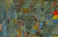
Jasper Johns "Map" 1963

The history of the relationship between mapping and art is a long and interesting one. While people like Jasper Johns are well known in this regard (see his painting "Map" above) there are literally hundreds of other artists working in this vein in one way or another.


The journal Cartographic Perspectives has featured a wide variety of map-art on its covers (either maps done artistically or art done cartographically) as seen here in this composite cover. A recent special issue had several articles on map-art.

I'm hoping to cover this topic a lot more on this blog. Suggestions would be welcome--I'm no expert!

Canadian Satellite: New Orleans is Sinking


First day of the new hurricane season today and a new RADARSAT map of New Orleans shows it is sinking faster than previously thought. On average it is sinking at 6mm a year, though in some areas as much as 29mm a year.

Apparently these data are gathered by a Canadian satellite because the US doesn't have an equivalent satellite for research purposes. Nature reports (via New Scientist) that this map may be influential in influencing policy in the area for rebuilding (the Mayor is sworn in today as well).

Of course New Orleans is on a delta and deltas are supposed to acquire silt, but the Mississippi is so channelized that all the deposits are washed out to sea.

5.30.2006

GOV-USA: Leip Vs. Kos

(Updated)

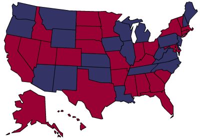
Gubernatorial Predictions, 2006.

Kos (9 pickups):


NY, MA, OH, AR, MD, CO, NV, RI, MN


Leip (5 pickups, note reversed color scheme):


MN, AR, OH, NY, MA

Update. Alaska was one other state Kos identified as a potential pickup, given that the GOP incumbent has a favorability rating of minus fifty. And it looks like there will indeed be an opportunity there.

5.29.2006

Why are Counties Difficult to Predict?

A couple of weeks ago Chris Bowers of myDD posted his map of political power by county:


This map is an attempt to show (using the typical red-Republican and blue-Democratic colors) how the country now looks in terms of approval ratings. Using it, Bowers can reasonably claim that the country has gone quite "blue" and he cites the latest SurveyUSA poll to show that in only 3 states does the President have favorable ratings (Idaho, Utah, Wyoming, see map).

Looks encouraging for liberals, right? In fact this map points up some interesting issues to do with politics at levels more detailed than the state. First, the map above is speculation, or perhaps at best extrapolation. As most people know, there are over 3,100 counties in the USA and it's difficult to say how they would look. As comments to Bowers' own post pointed out, his method is unclear (and not likely to be accurate).

Why is this? And why are counties so difficult to predict, politically?

1. There is a lack of data collected at that geographic scale

2. Inferring county-level data from available state data runs into the well-known ecological fallacy.

3. Even if every county was polled, there are many sparsely populated counties in America, which renders the result susceptible to sampling error. We'd also need to know the applicable "sampling frame" or the subset of the population the sample was drawn from (eg., registered voters, random telephone calls, etc.) which also shapes the result.

Perhaps we should forget about this level of data then? No: counties (and geographies at even finer levels of detail) are important:

1. Although many races occur statewide (notably Presidential and Senators) the House of Representatives and of course races for state office are based on districts within the state.

2. Getting an idea of support at the detailed level is important for voter registration and GOTV. You'll want to target areas perhaps even as detailed as the local precinct in GOTV or voter registration.

While I don't know the method used in producing the map above, it wouldn't be impossible to produce a map that estimated political support at the county level, if you could combine good local data/knowledge, previous county-level data (eg., percentage voting Kerry-Bush in '04) and some stratified sampling. I'm thinking of the Census Bureau ACS here.

Important resources:

1. David Leip's Electoral Atlas (purchase data at county level)

2. Anthony Robinson has free voting data he created himself

2. Fairdata2000

5.27.2006

Cool New Map App

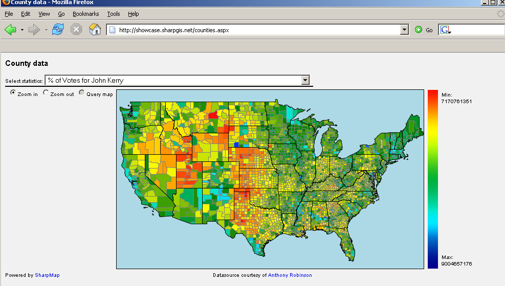
Following my post about the county level political data Morten Neilsen of "SharpGIS" has created a cool new mapping application to display the whole dataset (available from Anthony Robinson at Penn State).


Morten uses a double-ended color ramp which I'm not sure would pass muster in design textbooks, but that aside, it's a good example of what can be done when raw data are shared. Using his web app you can pull down and instantly display any of the data sets that Penn State makes available. I wasn't previously aware of the application SharpMap he uses but I was impressed by how quickly something can be created with it. Thanks!

Another correspondent also left a note about the FairData site which takes a slightly different approach. They have tons of data and provide an interactive map interface to it (ie they handle the mapping and the data rather than distributing the data for people to play with). This has the advantage of providing users with maps without having to learn map software. They appear to use Maptitude for the Web, which I found a bit clunky. Specifically the Info button doesn't work in Firefox (which they acknowledge).

These kinds of web-distributed political efforts have a real potential to help precision-mapping of get out the vote (GOTV) and voter registration efforts. They may even help people become more interested in politics since these tools (previously only available to precinct captains and activists) are now available to all.

5.25.2006

The Internet: Net Neutrality or Pay to Play?

Updated below

As a long-time user of the Internet, I'm naturally very concerned when something threatens access to it or threatens to balkanize it into little segments. Unfortunately there is such a threat at the moment. Telecom companies want to regulate content on the web and internet by differentially charging users to see content. Obviously, if access to web content varies by where you live or by how much you're willing to pay, that is, pay to play, this is not good. It will especially affect the little guy, most of us.

The concept of "net neutrality" is that the web should be open to all--as it is now. Major content providers such as Yahoo and Google are in favor of it. Tim Berners-Lee, who invented the web, is in favor of it.

Today a bipartisan bill, HR 5417 is being marked up. It's stated goal is to offer protections to net neutrality. Here's more info.

Update. The Judiciary Committee Dems seemed to have voted the right way in favor of the bill. Some commentators are warning of telcos obfuscation of the issue, so watch out.

Money Map

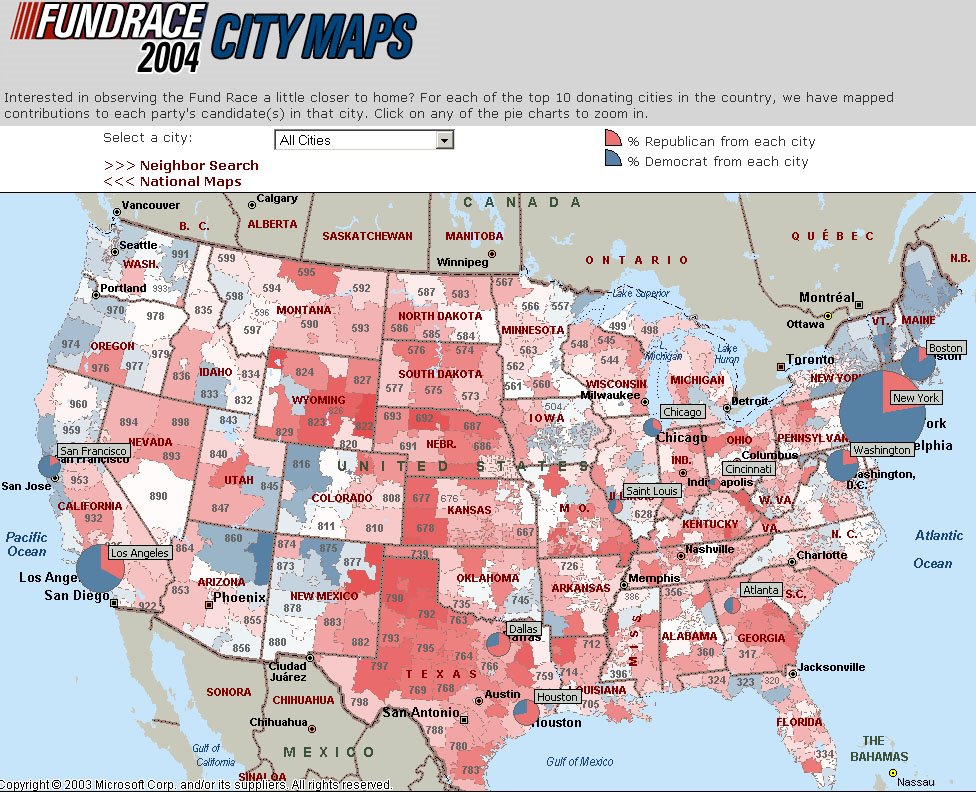
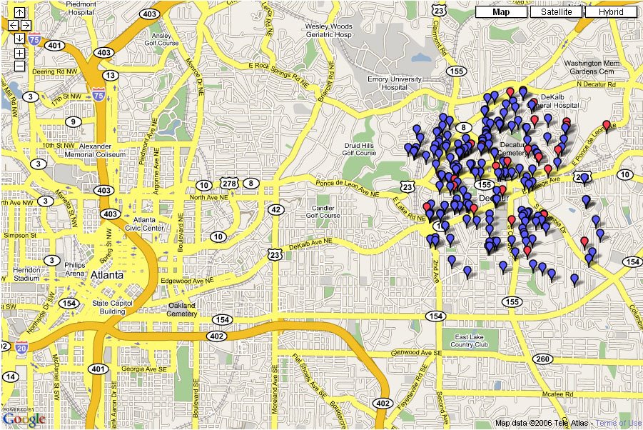
Follow the money:


USA Political donations


Atlanta political donations

I think the ATL map is interesting because everything I've seen about Atlanta suggests it is a tale of two cities ( north and south) rather than just urban/suburban ring. We see that again here. It really is amazing how consistent the pattern is. Mind you, DeKalb county to the East is not really on this map, so check out liberal Decatur:


Source: Fundrace, Matthew Kane

5.24.2006

County level map, 2004

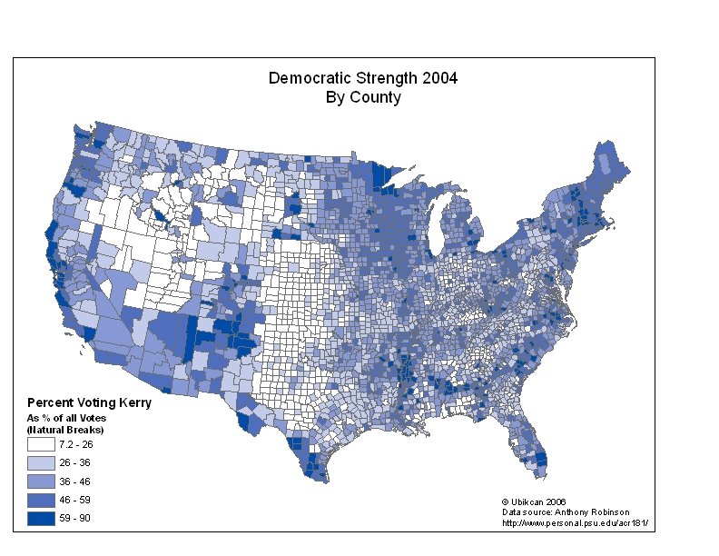
Usually for voting results you see statewide maps. These are useful in a presidential election because of the electoral college. they are less useful for getting a more detailed view of voters' preferences. Unfortunately data at the county level are not usually free.

However, I recently found some great county level data from Anthony Robinson which has voting data like the following:


I think it makes a very interesting map. You could do the same for a Bush strength map as well.

5.23.2006

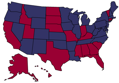
Prediction map of governors

Kos has a new prediction map of state governors:


Now

Jan. 2007

He's predicting Dem pickups in 9 states and no GOP pickups. As he points out, the deep South remains a problem for Dems.

David Leips's polling data are available here (note reversed color scheme).

5.21.2006

How mappy are we? Very.

It's a common meme that mapping is dead. Cartography has been killed off by digital maps and GIS. Yet the fact is we live in a world populated by more maps than ever. More maps are produced today than at any other time in human history. MapQuest may very well be the world's biggest map publisher with 60 million maps published every day.
How mappy are we? Consider this story* from South Texas, where a small town you've never heard of has implemented an online GIS for their residents. There's nothing particularly different about this system, the point is that places like McAllen Texas are implementing them. It's the sheer everydayness of mapping that is the point here.


*Please excuse the link to a newspaper owned by the yucky Freedom Communications, who enegage in so-called "astroturf" editorials.

5.20.2006

Columbus Officially Buried in Spain

A new DNA analysis of remains have confirmed that at least part of Columbus' body is buried in Spain:

MADRID, Spain - Scientists said Friday they have confirmed that at least some of Christopher Columbus' remains were buried inside a Spanish cathedral, a discovery that could help end a century-old debate over the explorer's final resting place.
I suppose this still leaves open the possibility that there are some remains in the Dominican Republic as well but they don't appear to want them to be tested.

5.19.2006

Live satellite tracking!

That was quick.

Last October I complained that there were no mashups of live satellite tracking.

Now there is and it's extremely cool:

The end of paper maps

The Times predicts the end of paper maps:

[GPS is] gradually killing off maps, the charts that have revealed the changing contours of our world and minds since the birth of culture. English mapmakers once placed the phrase Hic sunt dracones, “Here be dragons”, on maps to mark the edges of the known world. Charlene [the GPS] has slain what few dragons remained. With a GPS embedded in dashboard, wristwatch or mobile telephone, we will never be lost again.
Apart from the fact that cartographers never actually did put "here be dragons" on maps, I don't think our London correspondent is right. There's no way that paper maps will disappear. Did the horse disappear with the invention of the automobile? No, it exists alongside the car, although certainly its purpose changed.

The paper map is just too darned useful; it's light, needs no electricity, and is interoperable across systems and cultures. How many times have you printed out a digital map? I rest my case.

5.18.2006

A Perfect combo

A perfect combo of map and politics is achieved in the following map. Only 3 states in America give the President a positive job approval rating:


Source: Billmon, data here

5.16.2006

The Politics of Geography

The latest (5/15/06) opinion polls for President Bush in Georgia show an interesting geographical split between the Atlanta metro area and rural Georgia. But even outside the metro area his unfavorable ratings are high. Georgia as a whole is 43% approve, 55% disapprove.


South and East Georgia


Metro Atlanta


All Georgia

5.11.2006

Crashing the Gate, Atlanta!


Crashing the Gate came to Atlanta on Tuesday. Markos of Daily Kos was there and talked a bit about the new political landscape of netroot activism before taking some Q&A. It's podcasted here by the Georgia podcast network. The turnout, in Atlanta's famous Manuel's Tavern, was fantastic! I've only got low-res cellphone pictures, but here they are:


Getting ready


Markos and founder of Air America(?)


My attempt at a crowd scene...

5.08.2006

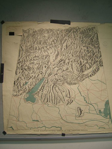
Beautiful block diagrams


Block diagrams are out of favor today, but at one time they were a useful and evocative way of representing terrain. One of the acknowledged experts in this field was Armin Lobeck (1886 - 1958). It's a shame that Lobeck's work is not better known (though his book things Maps Don't tell us is still in print and features a selection of his diagrams). As far as I know the only biographical work on him is a Masters thesis by Fred Grandinetti.

During WWI Lobeck was employed by the US government in their preparations for peace and he made a number of detailed studies of the areas likely to be discussed.

Here are some images of these maps (available at the National Archives, College Park, MD).

5.04.2006

"The Internet is our Edgar R. Murrow. It's all we have."

That comment was made in response to a story on Eric Boehlert's new book Lapdogs: How the Press Rolled Over for Bush which documents the way the press is not doing it's job anymore: critically investigating the spin emanating from the White House. In fact, the book suggests (not for the first time) that the press's complicity in the "Swift Boat" attacks on Kerry lost him the election and all that that entails.

Colbert's amazing routine at the annual White House Correspondents' Association dinner last Saturday is another example, and if it has been under-reported by the "MSM" this week, it's probably because of zingers like this one:

But, listen, let's review the rules. Here's how it works: the president makes decisions. He's the decider. The press secretary announces those decisions, and you people of the press type those decisions down. Make, announce, type. Just put 'em through a spell check and go home. Get to know your family again. Make love to your wife. Write that novel you got kicking around in your head. You know, the one about the intrepid Washington reporter with the courage to stand up to the administration. You know -- fiction!
Journos = typists.

So it's no surprise that people turn to the internet to get other news. Things like google.news.com or the BBC Online and as I've said before investigative blogging (Juan Cole, Atrios, TPMuckraker, etc.).

In this context then the recent moves to threaten "net neutrality" are extremely dangerous. If content is to be differentially moved across the internet because telcos and cable companies want people to pay them based on that content [not format] then we're hosed. I know threats to the internet have been around almost as long as... well the internet itself, but read here and make up your own mind. It's worth noting that the inventor of the web, Tim Berners-Lee, is on record preferring content neutrality.

We should know by now that knowledge is not separate from power.

5.01.2006

More Recent Sprawl Analyses

Since the NLCD data in the study cited below are a little old as Brian mentions below (not that that invalidates the data of course, particularly for time series analysis), here are some references to more recent studies:

Yang, Xiaojun "Satellite Monitoring of Urban Spatial Growth in the Atlanta Metropolitan Area" Photogrammetric Engineering and Remote Sensing, 2002, 68(7). Uses data from 1973-1999 (Thematic Mapper/Landsat).

Yang, X. and Lo, C.P. "Modelling Urban Growth and Landscape Changes in the Atlanta Metropolitan Area" Int. J. Geog. Inf. Sci. 17(5): 463-488.

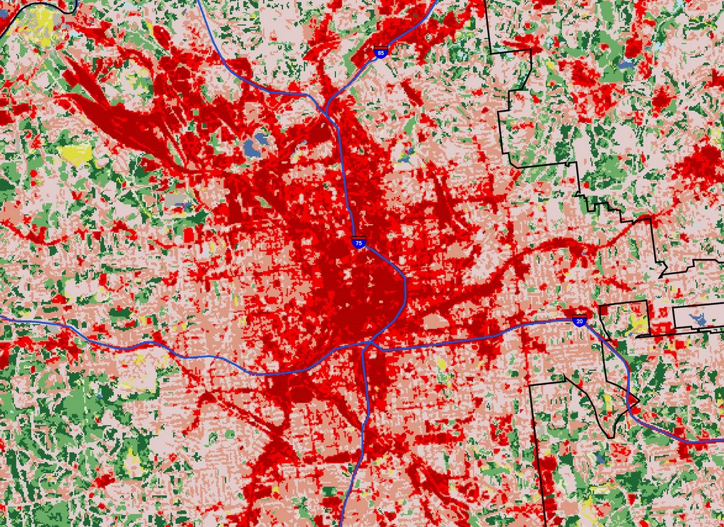
Finally, newer NLCD data actually are becoming available here (2002). Comparison of NLCD and Landscan data:


NLCD 2001 on left, Landscan on right. Approx. same scale but not exactly (and on diff. projections I believe).

Detail of downtown Atlanta. Red indicates urban areas I believe. City of Atlanta boundary shown in black. Original resolution is 30m square.

Atlanta May 1 Rally

Pictures from the rally today in Atlanta.