7.02.2006

Princess Margaret's Face Lift


The relationship between the famous and the public who sustain them is governed by a striking paradox. Infinitely remote, the great stars of politics, film and entertainment move across an eclectic terrain of limousines and bodyguards, private helicopters and state functions. At the same time, the zoom lens and the interview camera bring them so near to us that we know their faces and their smallest gestures more intimately than those of our friends.

Somewhere in this paradoxical space our imaginations are free to range, and we find ourselves experimenting like impresarios with all the possibilities that these magnified figures offer us. How did Garbo brush her teeth, shave her armpits, probe a worry-line? The most intimate details of their lives seem to lie beyond an already open bathroom door that our imaginations can easily push aside. Caught in the glare of our relentless fascination, they can do nothing to stop us exploring every blocked pore and hesitant glance, imagining ourselves their lovers and confidantes. In our minds we can assign them any roles we choose, submit them to any passion or humiliation. And as they age, we can remodel their features to sustain our deathless dream of them.

--J. G. Ballard, The Atrocity Exhibition, p. 111.

6.30.2006

Check out atlas(t)

Just discovered this fantastic new blog, atlas(t), on maps and ways of defining (lots of stuff on naming; several posts on Monmonier's new book). From their opening statement:

We will be explicitly and unapologetically political; we will speak/write from our own cultural context and perspective and not pretend to any impossible journalistic objectivity; we will rant and complain all we like.

We will behave as if this blog is in itself a political act, and furthermore as if the "real estate" or virtual space occupied by this blog is of socio-political and cultural importance ... as if, in fact, our being here mattered.

Wish I'd said that! Mucho cool stuff, check it out.

Study: Cell Phone Users as Bad as Drunk Drivers!

I knew it!

Even using the hands free option, cell phone drivers drive as poorly as those legally over the limit. What's also interesting is that cell phone users deny being affected and think they are driving just fine.

6.25.2006

Anybody read this or know about it?

A new book: The Power of Projections: How Maps Reflect Global Politics and History by Arthur Klinghoffer at Rutgers (Camden) University?

The Amazon page doesn't have much info, but the description looks interesting. Klinghoffr is apparently a prof. of political scince.

6.21.2006

New Method for Dating Maps


Cool. Perhaps this will allow dating of all those controversial maps!

A new and relatively simple method for discovering the date when centuries-old art prints and books were produced has been developed at Penn State. The method could reveal long-sought information about thousands of undated works printed on hand-operated presses prior to the development of modern printing methods in the mid-19th century, including works by Rembrandt and Shakespeare.
Hedges, a world-renowned biologist whose hobby involves Renaissance prints and maps, developed his "print clock" method by first measuring time-related changes in 2,674 Renaissance works. He found that the number of breaks in the lines of images printed from woodblock carvings increased over time, while the image intensity became more pale in copperplate prints...

Hedges' woodblock studies involved four editions of Bordone's Isolario, an atlas containing maps of islands. The print date was known for three of the editions, published in 1528, 1534, and 1547, but the age of the undated book has been debated for nearly 200 years, with estimates ranging from 1537 to 1570...

In addition, Hedges used his print-clock technique to calculate the day on which there were no cracks in the wood, revealing the date when the artist finished carving the woodblock. "This estimate of the date the woodblock was carved seemed odd because it was ten years before the date of the first print, but it turned out that the carving date agreed with the historical records, which place the cartography in that earlier decade," Hedges says.

6.04.2006

Red State, Blue State

Digby has an important post about political values and the red state-blue state divide. While at first sight it appears to have nothing to do with maps, it's actually really about the thing that maps are about themselves: namely the political scene itself.

The immediate context is Josh Marshall's post about the New Yorker piece decrying the fact that Democrats are liberals and keep nominating obviously unwinnable candidates:

I think I've read this article one hundred times -- both in its pre-2006 versions and the new-and-improved 2006 editions.

It goes something like this.

President Bush is very unpopular these days and Democrats think they may win back the Congress because of it. But is hating President Bush enough? Or do Democrats need a positive agenda as an alternative to the Republicans? It is thought by some that it might not be enough. Those somes are right to be worried because there aren't as many liberals in the US as conservatives. So trying to frame the election around torture and warrantless wiretaps may not be a good idea. Another reason to be worried is that the white working class, farmers, suburbanites and deeply religious are no longer all reliable Democratic constituencies. But there are some candidates trying to reach out to these ignored constituencies. But will those centrists be forced to cater to the party base and its philosophy of pessimism? It is feared by some that they may be forced to cater.

That's Josh's parody/summary of the New Yorker. Don't nominate a candidate who caters to the progressive base, avoid those values, move to the center, there aren't enough supporters ("liberals") to win.

Both Josh and Digby reject this approach on the following grounds:

1. Digby says that this approach has been tried and it doesn't work: conservatives still hate the southern/centrist/religious Democratic candidates (their names were Jimmy Carter and Bill Clinton). One was impeached and the other is being attacked with censure, 25 years after leaving office.

2. Here's where the geography/maps come in: the point is that there's no such thing as red state/blue state. Maps sometimes make it look like that, but what is really out there is a bunch of people with varying views and we can draw lines around them in any number of ways. Also not to mention that elections take place at all levels of geography (federal, state, local, urban, suburban, exurban, rural...). So the key is not to see a red state and say it's unwinnable, but to see it as diverse and without stereotyped values. In this regard the argument by Ruy Teixeira on whether the suburbas "are" really Republican or a mix of values is very exciting and one of the pieces that got me thinking about mapping and politics. If you could map that diversity more closely and less stereotypically, perhaps at precision mapping levels, you would I think see the diversity. But how to reveal the diversity--that's my interest.

3. Finally, it's still the case that holding to your values is a good thing. Conservative values are on the wrong side of history, especially socially. As for the mood of the country being conservative:
The "mood of the country" is an extremely complex, ephemeral thing with many permutations, not all of them political. But if the the elite press and its GOP string pullers have decided that the political mood is conservative, the last thing I want to do is accomodate it. I want to change it.
Dem's fighting words!

6.01.2006

Art:Maps


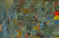
Jasper Johns "Map" 1963

The history of the relationship between mapping and art is a long and interesting one. While people like Jasper Johns are well known in this regard (see his painting "Map" above) there are literally hundreds of other artists working in this vein in one way or another.


The journal Cartographic Perspectives has featured a wide variety of map-art on its covers (either maps done artistically or art done cartographically) as seen here in this composite cover. A recent special issue had several articles on map-art.

I'm hoping to cover this topic a lot more on this blog. Suggestions would be welcome--I'm no expert!

Canadian Satellite: New Orleans is Sinking


First day of the new hurricane season today and a new RADARSAT map of New Orleans shows it is sinking faster than previously thought. On average it is sinking at 6mm a year, though in some areas as much as 29mm a year.

Apparently these data are gathered by a Canadian satellite because the US doesn't have an equivalent satellite for research purposes. Nature reports (via New Scientist) that this map may be influential in influencing policy in the area for rebuilding (the Mayor is sworn in today as well).

Of course New Orleans is on a delta and deltas are supposed to acquire silt, but the Mississippi is so channelized that all the deposits are washed out to sea.

5.30.2006

GOV-USA: Leip Vs. Kos

(Updated)

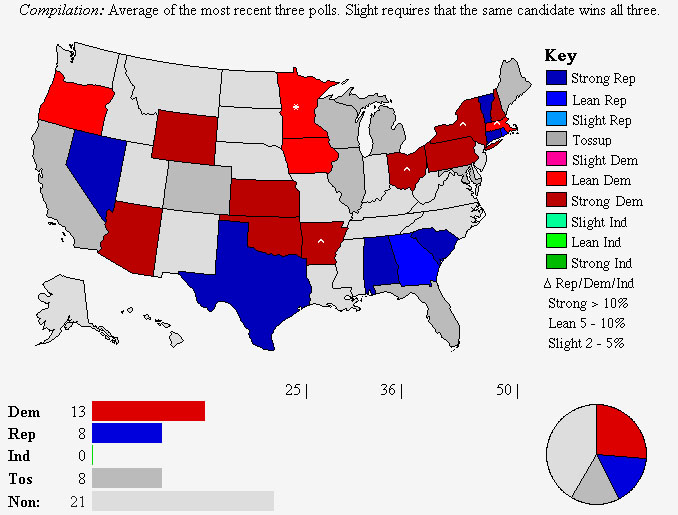
Gubernatorial Predictions, 2006.

Kos (9 pickups):


NY, MA, OH, AR, MD, CO, NV, RI, MN


Leip (5 pickups, note reversed color scheme):


MN, AR, OH, NY, MA

Update. Alaska was one other state Kos identified as a potential pickup, given that the GOP incumbent has a favorability rating of minus fifty. And it looks like there will indeed be an opportunity there.

5.29.2006

Why are Counties Difficult to Predict?

A couple of weeks ago Chris Bowers of myDD posted his map of political power by county:


This map is an attempt to show (using the typical red-Republican and blue-Democratic colors) how the country now looks in terms of approval ratings. Using it, Bowers can reasonably claim that the country has gone quite "blue" and he cites the latest SurveyUSA poll to show that in only 3 states does the President have favorable ratings (Idaho, Utah, Wyoming, see map).

Looks encouraging for liberals, right? In fact this map points up some interesting issues to do with politics at levels more detailed than the state. First, the map above is speculation, or perhaps at best extrapolation. As most people know, there are over 3,100 counties in the USA and it's difficult to say how they would look. As comments to Bowers' own post pointed out, his method is unclear (and not likely to be accurate).

Why is this? And why are counties so difficult to predict, politically?

1. There is a lack of data collected at that geographic scale

2. Inferring county-level data from available state data runs into the well-known ecological fallacy.

3. Even if every county was polled, there are many sparsely populated counties in America, which renders the result susceptible to sampling error. We'd also need to know the applicable "sampling frame" or the subset of the population the sample was drawn from (eg., registered voters, random telephone calls, etc.) which also shapes the result.

Perhaps we should forget about this level of data then? No: counties (and geographies at even finer levels of detail) are important:

1. Although many races occur statewide (notably Presidential and Senators) the House of Representatives and of course races for state office are based on districts within the state.

2. Getting an idea of support at the detailed level is important for voter registration and GOTV. You'll want to target areas perhaps even as detailed as the local precinct in GOTV or voter registration.

While I don't know the method used in producing the map above, it wouldn't be impossible to produce a map that estimated political support at the county level, if you could combine good local data/knowledge, previous county-level data (eg., percentage voting Kerry-Bush in '04) and some stratified sampling. I'm thinking of the Census Bureau ACS here.

Important resources:

1. David Leip's Electoral Atlas (purchase data at county level)

2. Anthony Robinson has free voting data he created himself

2. Fairdata2000

5.27.2006

Cool New Map App

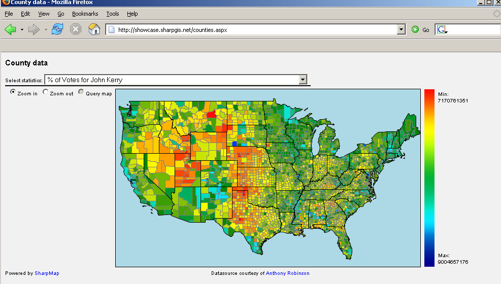
Following my post about the county level political data Morten Neilsen of "SharpGIS" has created a cool new mapping application to display the whole dataset (available from Anthony Robinson at Penn State).


Morten uses a double-ended color ramp which I'm not sure would pass muster in design textbooks, but that aside, it's a good example of what can be done when raw data are shared. Using his web app you can pull down and instantly display any of the data sets that Penn State makes available. I wasn't previously aware of the application SharpMap he uses but I was impressed by how quickly something can be created with it. Thanks!

Another correspondent also left a note about the FairData site which takes a slightly different approach. They have tons of data and provide an interactive map interface to it (ie they handle the mapping and the data rather than distributing the data for people to play with). This has the advantage of providing users with maps without having to learn map software. They appear to use Maptitude for the Web, which I found a bit clunky. Specifically the Info button doesn't work in Firefox (which they acknowledge).

These kinds of web-distributed political efforts have a real potential to help precision-mapping of get out the vote (GOTV) and voter registration efforts. They may even help people become more interested in politics since these tools (previously only available to precinct captains and activists) are now available to all.

5.25.2006

The Internet: Net Neutrality or Pay to Play?

Updated below

As a long-time user of the Internet, I'm naturally very concerned when something threatens access to it or threatens to balkanize it into little segments. Unfortunately there is such a threat at the moment. Telecom companies want to regulate content on the web and internet by differentially charging users to see content. Obviously, if access to web content varies by where you live or by how much you're willing to pay, that is, pay to play, this is not good. It will especially affect the little guy, most of us.

The concept of "net neutrality" is that the web should be open to all--as it is now. Major content providers such as Yahoo and Google are in favor of it. Tim Berners-Lee, who invented the web, is in favor of it.

Today a bipartisan bill, HR 5417 is being marked up. It's stated goal is to offer protections to net neutrality. Here's more info.

Update. The Judiciary Committee Dems seemed to have voted the right way in favor of the bill. Some commentators are warning of telcos obfuscation of the issue, so watch out.

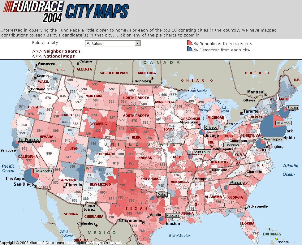
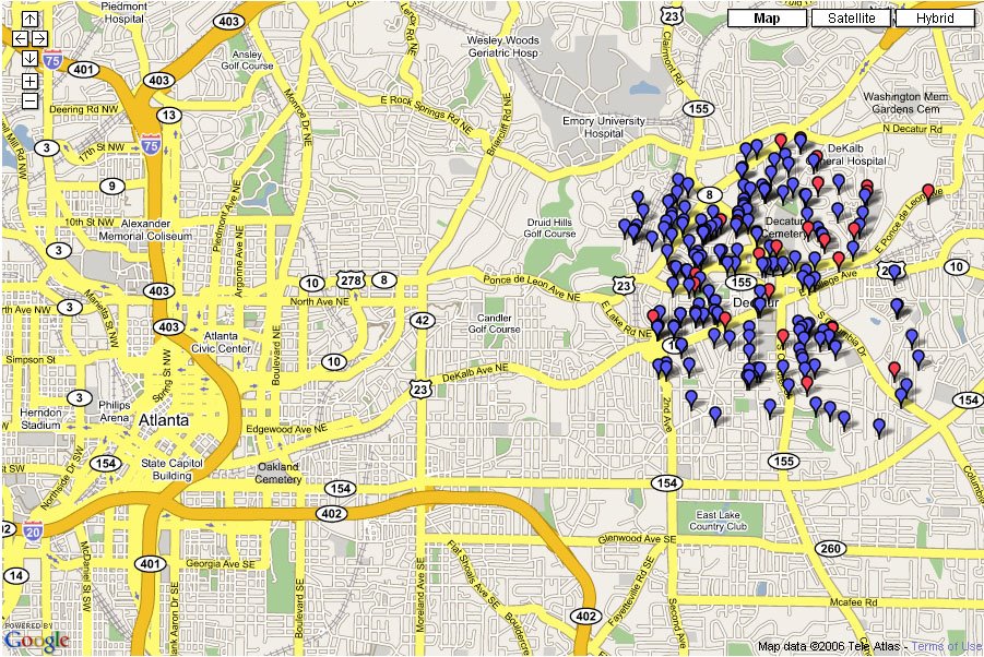
Money Map

Follow the money:


USA Political donations


Atlanta political donations

I think the ATL map is interesting because everything I've seen about Atlanta suggests it is a tale of two cities ( north and south) rather than just urban/suburban ring. We see that again here. It really is amazing how consistent the pattern is. Mind you, DeKalb county to the East is not really on this map, so check out liberal Decatur:


Source: Fundrace, Matthew Kane

5.24.2006

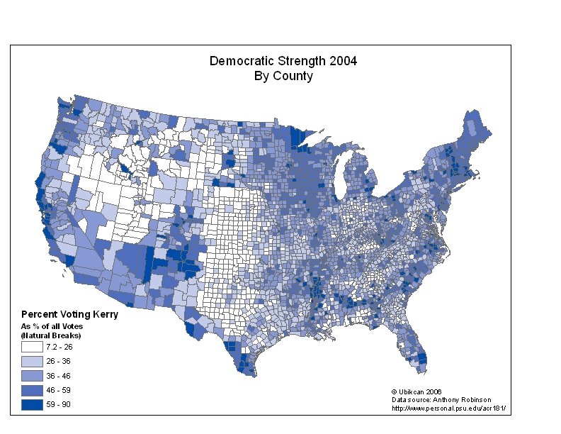
County level map, 2004

Usually for voting results you see statewide maps. These are useful in a presidential election because of the electoral college. they are less useful for getting a more detailed view of voters' preferences. Unfortunately data at the county level are not usually free.

However, I recently found some great county level data from Anthony Robinson which has voting data like the following:


I think it makes a very interesting map. You could do the same for a Bush strength map as well.

5.23.2006

Prediction map of governors

Kos has a new prediction map of state governors:


Now

Jan. 2007

He's predicting Dem pickups in 9 states and no GOP pickups. As he points out, the deep South remains a problem for Dems.

David Leips's polling data are available here (note reversed color scheme).

5.21.2006

How mappy are we? Very.

It's a common meme that mapping is dead. Cartography has been killed off by digital maps and GIS. Yet the fact is we live in a world populated by more maps than ever. More maps are produced today than at any other time in human history. MapQuest may very well be the world's biggest map publisher with 60 million maps published every day.

How mappy are we? Consider this story* from South Texas, where a small town you've never heard of has implemented an online GIS for their residents. There's nothing particularly different about this system, the point is that places like McAllen Texas are implementing them. It's the sheer everydayness of mapping that is the point here.


*Please excuse the link to a newspaper owned by the yucky Freedom Communications, who enegage in so-called "astroturf" editorials.

5.20.2006

Columbus Officially Buried in Spain

A new DNA analysis of remains have confirmed that at least part of Columbus' body is buried in Spain:

MADRID, Spain - Scientists said Friday they have confirmed that at least some of Christopher Columbus' remains were buried inside a Spanish cathedral, a discovery that could help end a century-old debate over the explorer's final resting place.
I suppose this still leaves open the possibility that there are some remains in the Dominican Republic as well but they don't appear to want them to be tested.

5.19.2006

Live satellite tracking!

That was quick.

Last October I complained that there were no mashups of live satellite tracking.

Now there is and it's extremely cool:

The end of paper maps

The Times predicts the end of paper maps:

[GPS is] gradually killing off maps, the charts that have revealed the changing contours of our world and minds since the birth of culture. English mapmakers once placed the phrase Hic sunt dracones, “Here be dragons”, on maps to mark the edges of the known world. Charlene [the GPS] has slain what few dragons remained. With a GPS embedded in dashboard, wristwatch or mobile telephone, we will never be lost again.
Apart from the fact that cartographers never actually did put "here be dragons" on maps, I don't think our London correspondent is right. There's no way that paper maps will disappear. Did the horse disappear with the invention of the automobile? No, it exists alongside the car, although certainly its purpose changed.

The paper map is just too darned useful; it's light, needs no electricity, and is interoperable across systems and cultures. How many times have you printed out a digital map? I rest my case.

5.18.2006

A Perfect combo

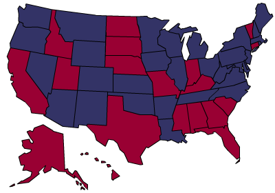
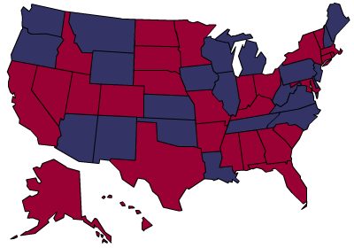
A perfect combo of map and politics is achieved in the following map. Only 3 states in America give the President a positive job approval rating:


Source: Billmon, data here